
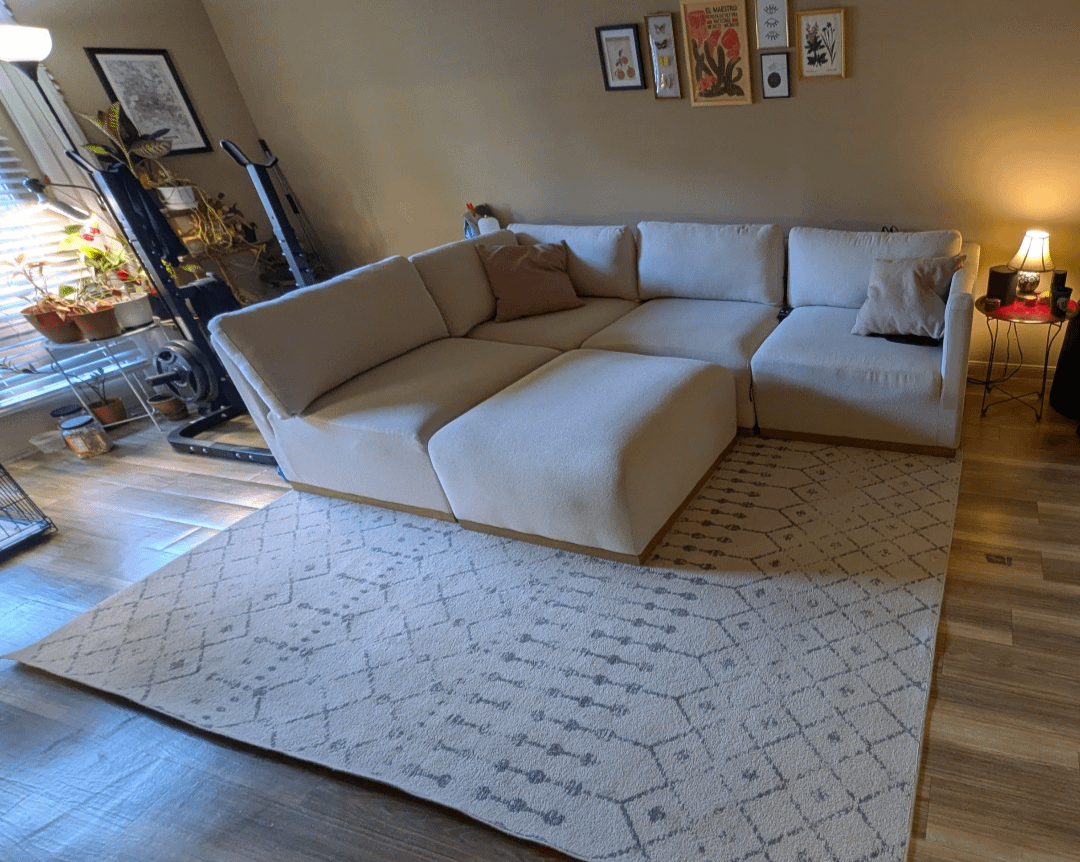


The camera zoom out is kind of warping the room and making it look really vertical, but in person everything is more horizontal. Couch is modular so the ottoman moves. And I know the rug should be a bit more under the couch but we have as much out as we can for my ancient little dog (she needs the traction). We will probably scooch it under a tad
First rug is the current that we need to replace
I know my art is too high but I used command strips (rent) so I think moving it down would cause some of the crappy paint here to come up. Will probably fill that large space with other art that isn't framed art
by HiILikePlants
43 Comments
I like 3. It looks great and fits perfectly with the colors in your room.
3 is SO cool! Pls get that. It goes so well with everything else in there!
Both 2 and 3 appeal to me. I think you have more choice with accent colors with 3 though.
3 by far
Both 2 and 3 appeal to me. I think you have more choice with accent colors with 3 though.
3, but 2 is pretty okay.
3!
2 & 3 look great especially 3!!
#3
Three is fabulous.
Definitely number 3
Love 3!
I like 2. Not matchy matchy and doesn’t disappear. Plus you can branch out with other colors for accents. Feels calm too. Three feels loud to me. I’m sure you’ll make the right choice for you!
Along with your artwork, you’ve got a vibe when you add 3.
Anything but 1! So overdone. I really love 3!!
2
I like 2 best. 3 is too much and 2 is too little. 2 is the Goldilocks one.
3
3
3 no contest
#3
I like 2.
1 is bland and wrong orientation.
3 seems too aggressive.
I really like 3 in that space! Where is it from?
Three is so fun!
1
3!!!
Three
Anyone know where to find #3 online? Love it.
No, yes, yes
I have both 2 and 3 (in turquoise) and I love both! 2 looks better in person and the pic doesn’t do it justice
https://preview.redd.it/hbxaqvk78pah1.png?width=439&format=png&auto=webp&s=4ecc3c21e301241269b3099a4d331a96718ff05e
I like #2. The first one is way too blah and the third is to bold. But the orientation is wrong on all three, and they need to be pushed farther under the couch.
3
3
Love 3!! Where’s it from?
3
I like 3 but can you try rotating the rug 90 degrees?
3 perfectly ties in the wall color.
I am leaning towards #2 as it is faded-looking and less “eye catching”. This also introduces another muted color into your room, which at this point is very cream/yellow. I think using that dusty rose/rust color in the rug for some throw pillows would bring your room together Z
3
3 by a mile!
3 is perfect!
2
The last rug looks like you designed the room around it. Absolutely beautiful