
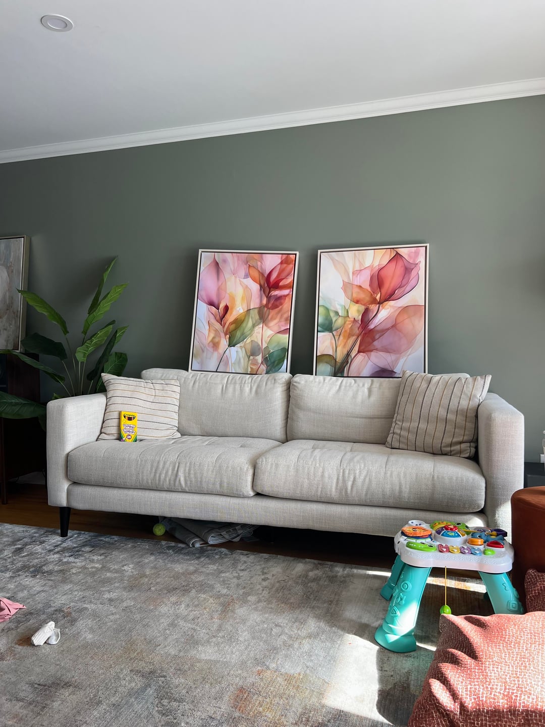
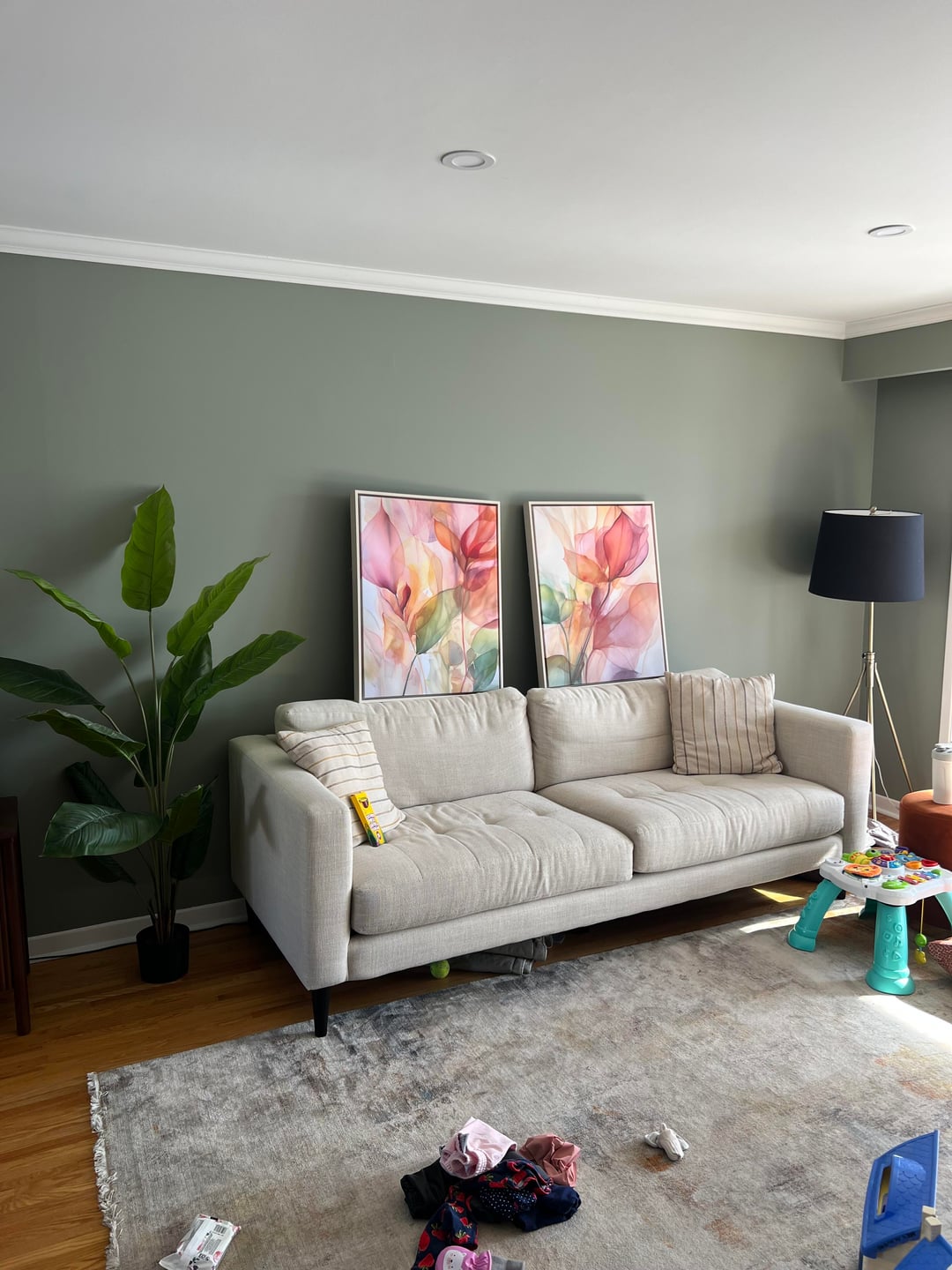
we found these prints above the couch at a local store and thought we’d give them a try. I’m normally more of a muted decoration person, whereas my partner loves saturation and vibrancy. this feels so out of my comfort zone, but there is something I like about it. the room feels like spring with the bright prints above the couch, however, I sometimes look and wonder is this a terrible home decor decision.
i welcome any thoughts on this, in terms of ”yay” or “nay” and if it is a yes, how I can make it work in this space. we have the light furniture but also a lot of walnut in the room.. I think I’d need to add more light accent pieces to make things feel more cohesive if we go with these pictures.
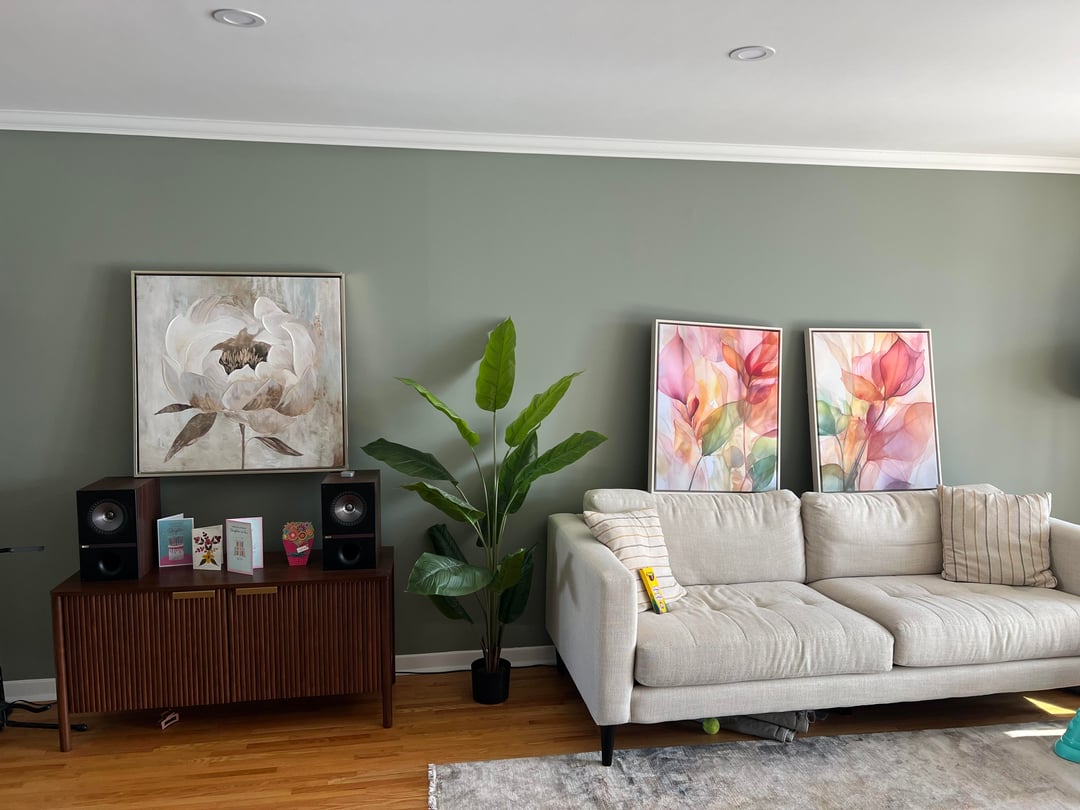
note: the picture above the speakers would not stay. That is a piece I’d normally go with compared to the ones over the couch. also, please don’t mind the toys and mess
by Alternative-Kiwi1750
11 Comments
The art itself is fine – inoffensive, proper size & scale – but it clashes with the wall color. If you’re sold on the art, paint the wall. If you don’t want to paint the wall, return the art and try again..
I like it and I think it actually goes with the wall art. The soft green is a nice compliment to the colors in the art. My recommendation is to leave it up like that for a few days and see if it grows on you and you’d be comfortable with that added color though
It all goes together really well. It coordinates with the color of the walls. Decor shouldn’t be monotone. These give the eye somewhere to rest where as before nothing stood out or had depth. These are perfect, and hopefully a gateway to more depth and tones in your house.
I actually love this so much. I think that green is always going to play tricks based on light so I agree on leaving it up for a few days. It’s beautiful to me.
I love this but I think it would look better if you hung the pics
I’d put the larger painting centered behind the couch. Then try the paired art on spaced apart near the speakers. You could move them to the edge of the couch and it might work too. They don’t b look correct so close together though.
A definite yay! The colors are beautiful, not in-your-face loud. I actually like your current pillows with the art. They’re not matchy-matchy and keep things nice and muted.
What color are your walls? They are beautiful!
Love ’em. Hang them and enjoy!
A definite YAY! Btw I think the picture above the speakers could stay in the room, but maybe on another wall – it is very different in color but it has the same floral theme and it is quite neutral.
Love it!