
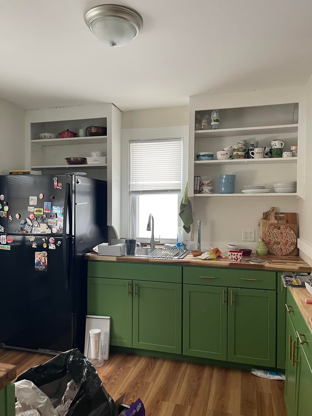
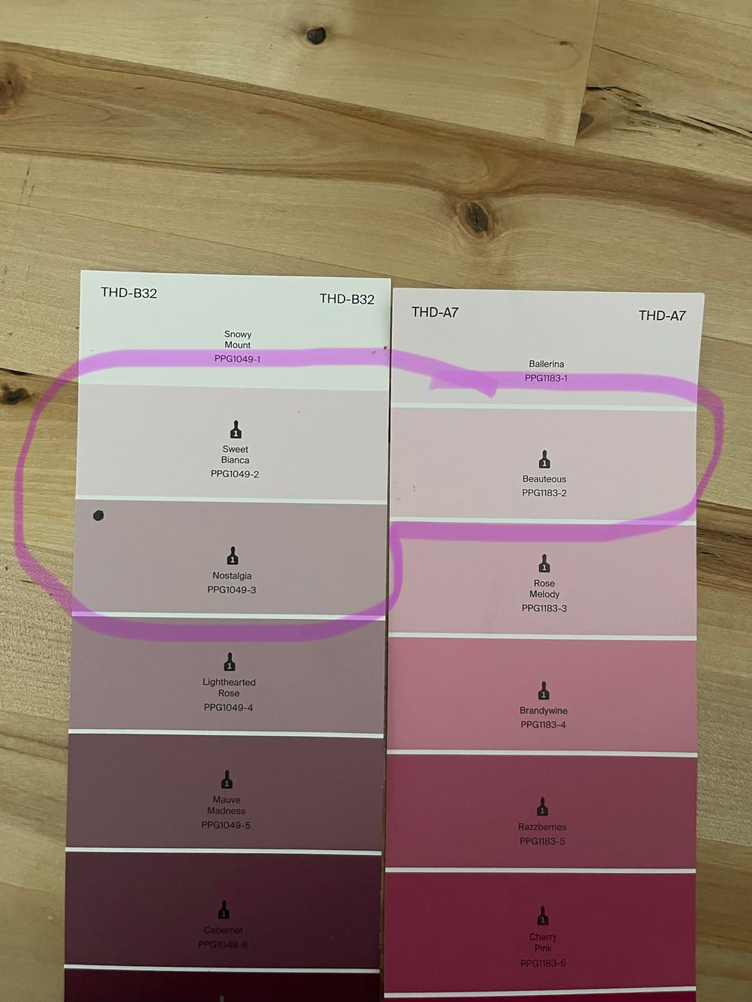
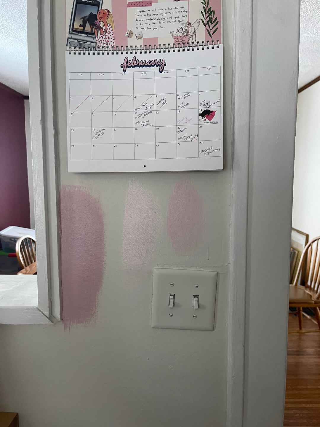
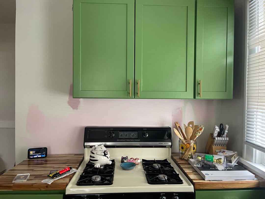
Currently walls are “pearly white”. I want actual or hinted at color on the walls, but also don’t want my kitchen to look insane. I tested out these three pinks and think the lightest (sweet Bianca) looks the best because it’s very subtle but I’m still not sold. Is there something that would look better? I’m open to any color. Keeping shelves and trim white.
by potatochild3
4 Comments
I really love this color combo! I like either of the two lighter pinks, with a slight preference towards the palest .
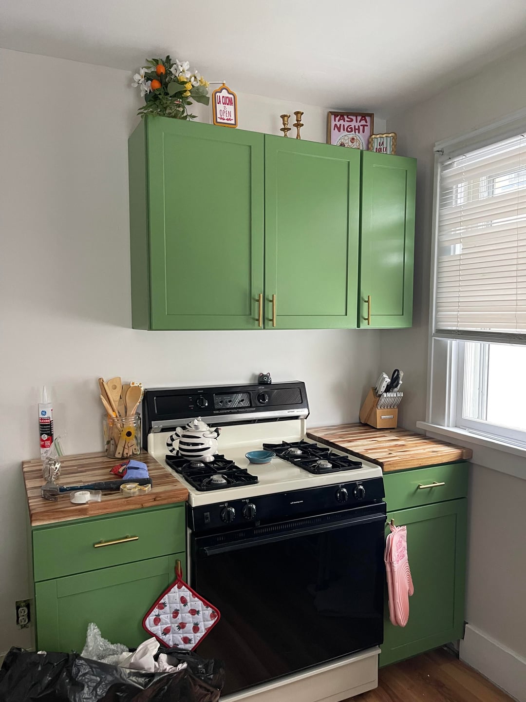
I love the green cabinets! First swatch on the left the top color??
Your lightest is very saturated in color. It needs toning down. If you want a hint of pink, search for “light pink neutral white” or something for inspiration.
For example, the “blush” colors here are warm like your green but subtle:
https://preview.redd.it/lbe4y687pphg1.jpeg?width=1200&format=pjpg&auto=webp&s=854ca05f73fcc425f79a0eecb9f4fc2f96ee870c
Look at this “neutral” by farrow and ball, and how it reads pink in this inspo photos: [Tailor Tack](https://www.farrow-ball.com/us/paint/tailor-tack)
That does not mean you cannot pick a saturated color like your current samples—you absolutely can. It just depends on whether you want your kitchen to be louder or softer with it, bright pop-art or more sophisticated.
Have fun!
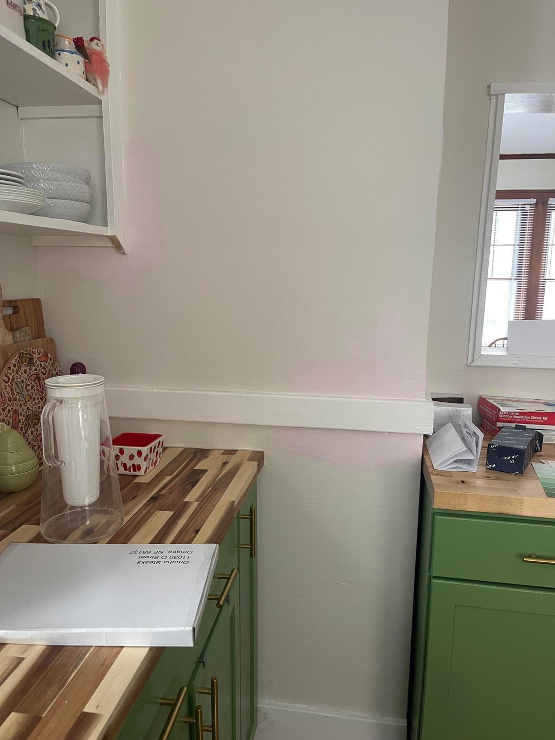
It will add a lot of soft light to the room, it’s a big improvement. I do question not committing to the open vista of a two-tone kitchen – especially with the multi-colored counters! Leaving random green and white lumps on the walls, when you could have a clean visual – consider going all in to cut down on the noise and give the counters their own space.
You might want to consider a more natural green on the lower cabinets, as the bright green will likely clash with the more delicate pink – two entirely different moods. But clash is an English decor specialty,