
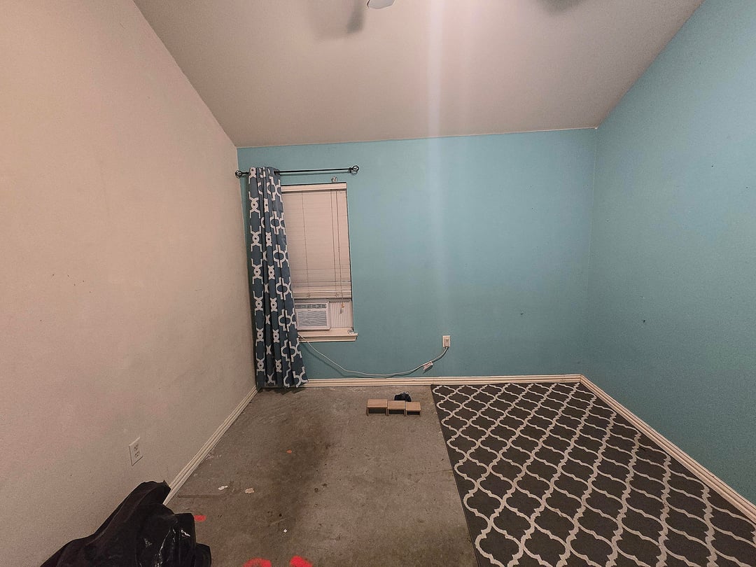
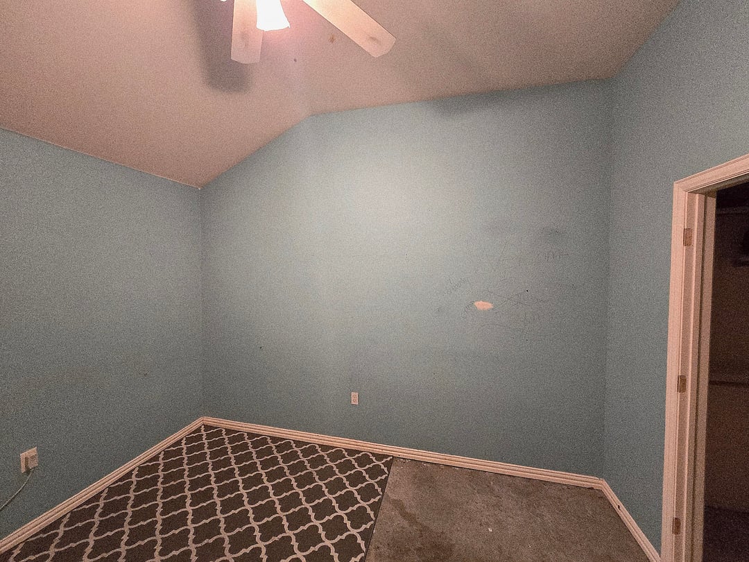
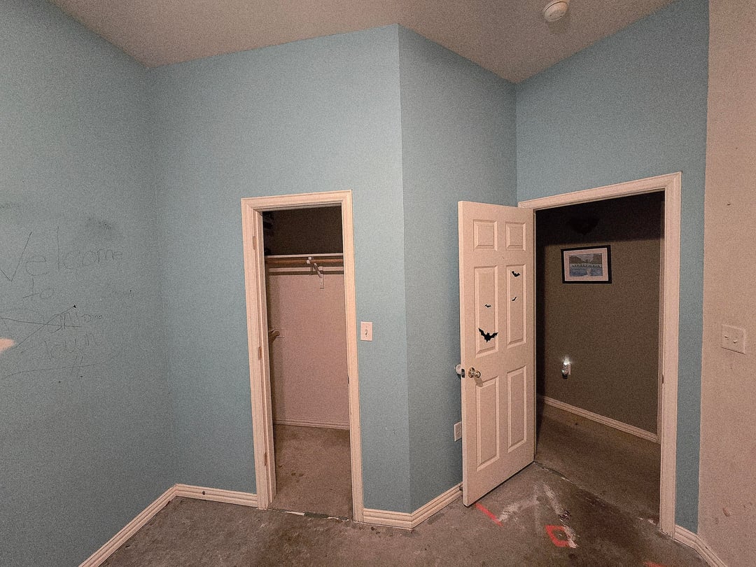
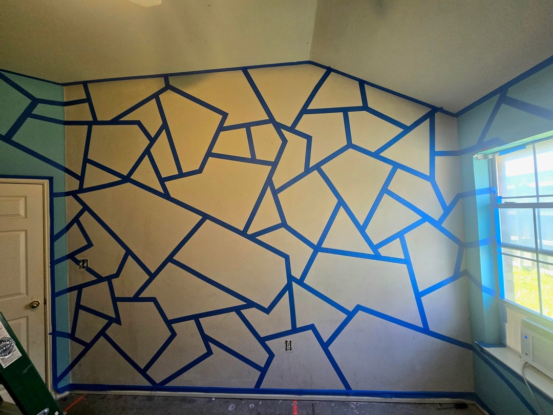
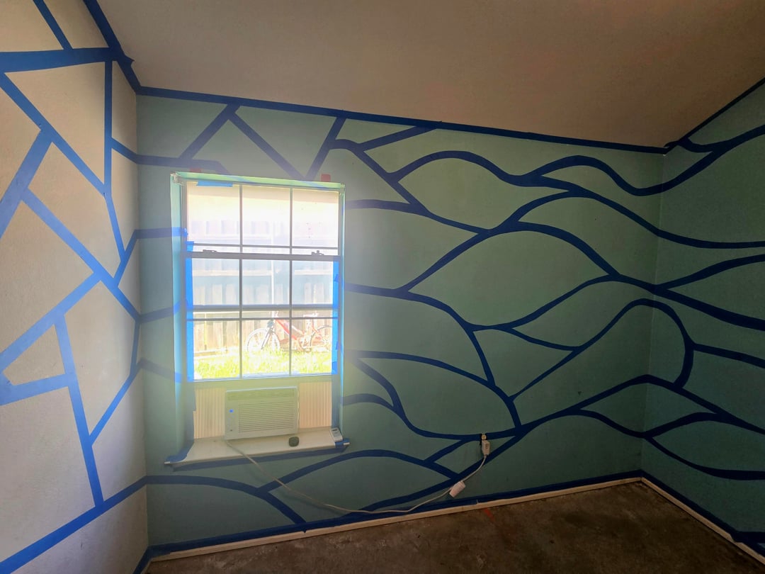
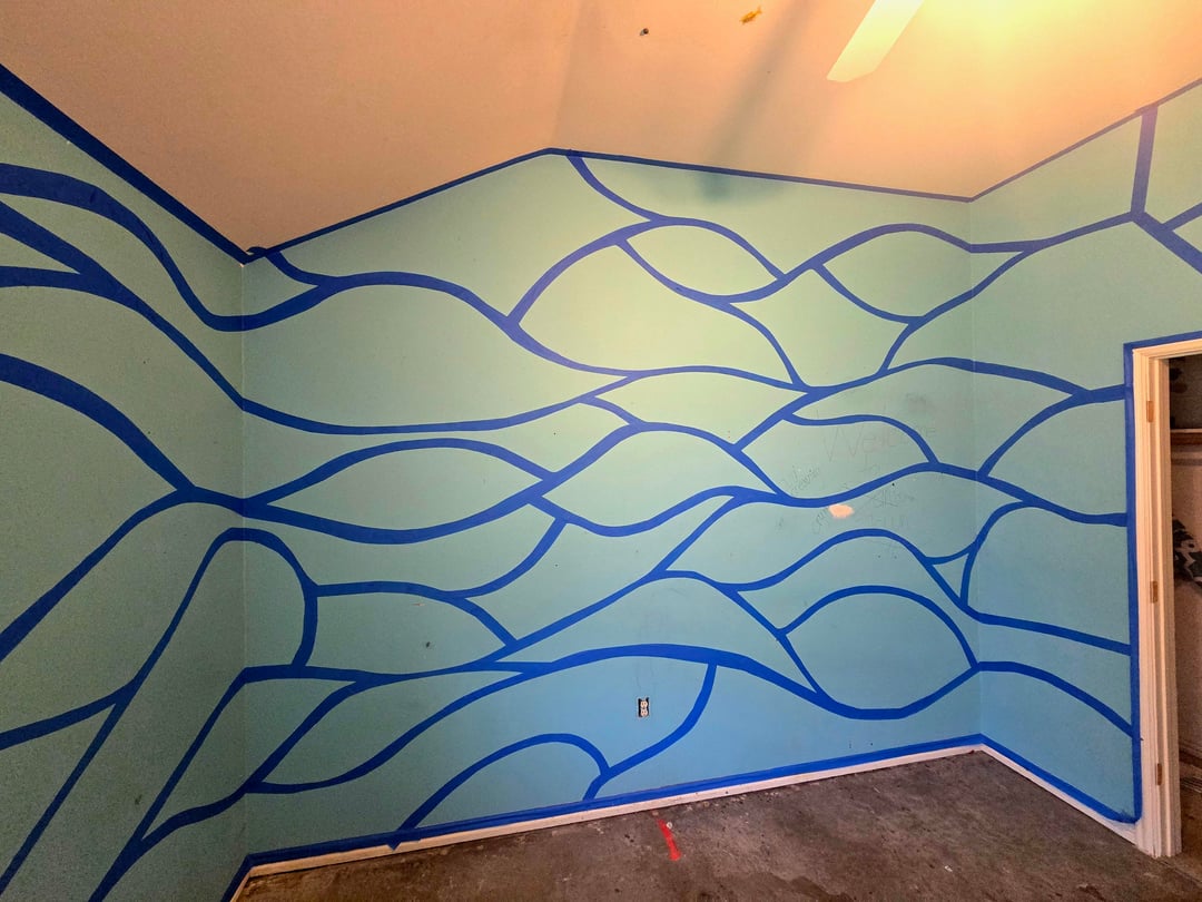
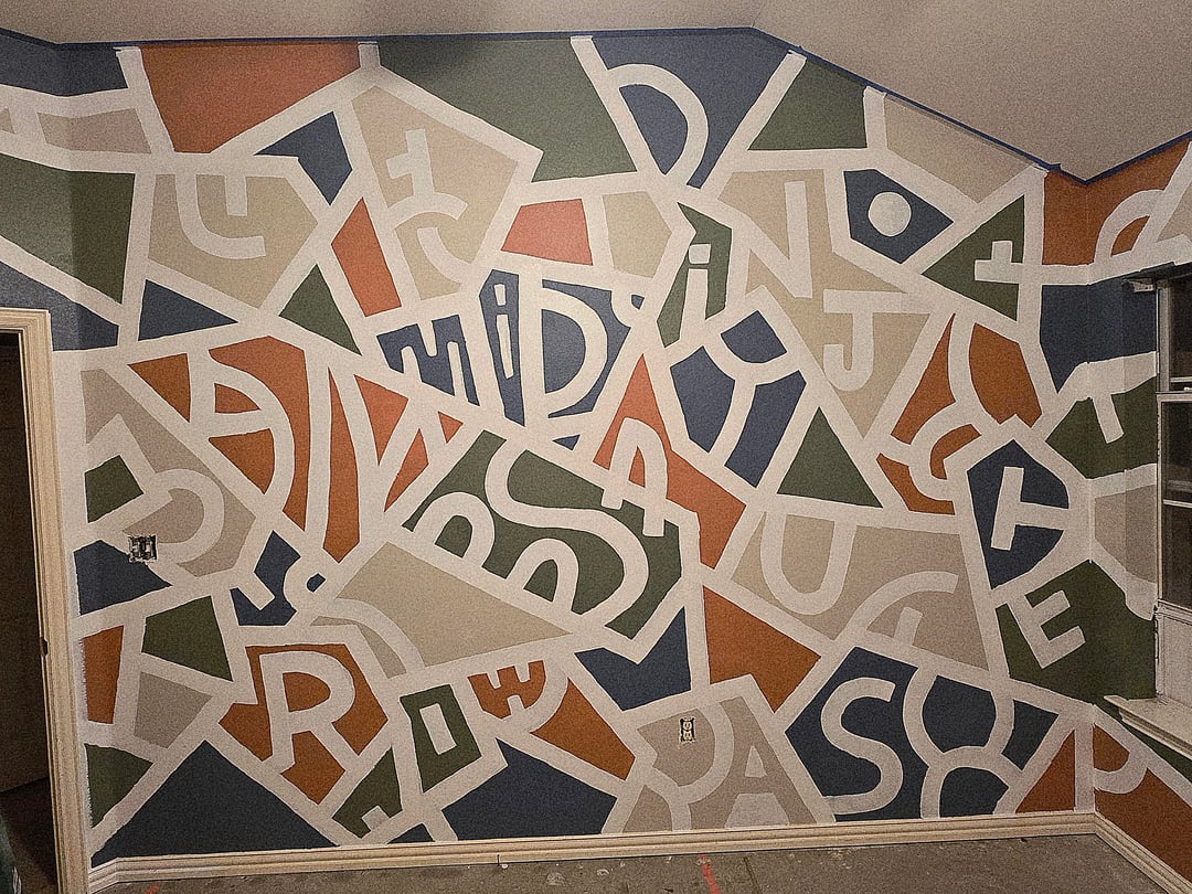
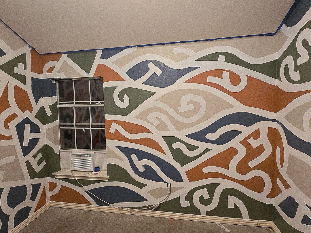
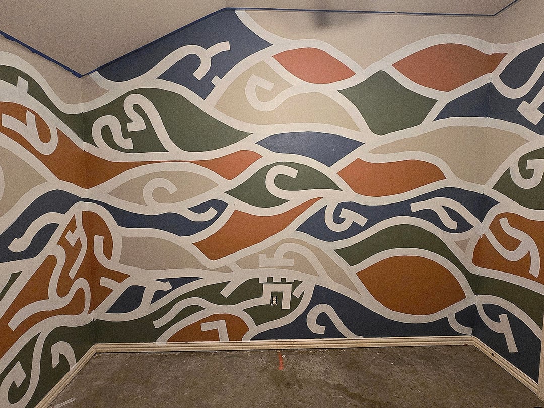
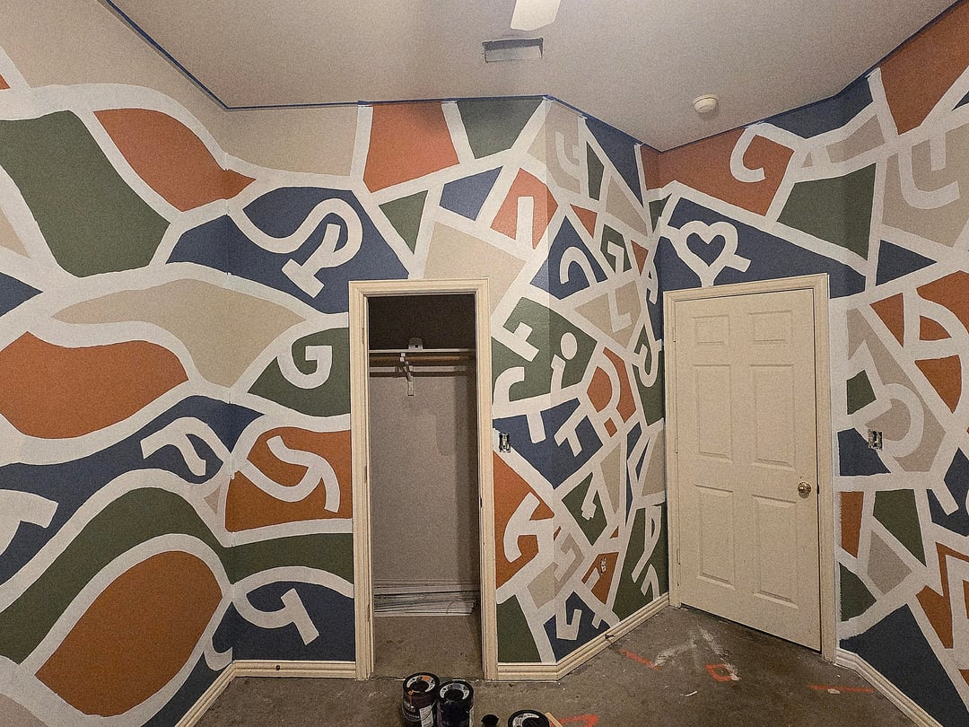
So, our oldest daughter moved out. I decided to turn her old room into my other kid's game room. I decided to go with a mosaic-doodle style art project for the walls that blends into eventual wave designs.
I'm not fully done yet because I still have flooring, new electrical sockets, outlet covers, window blinds, eventual furniture, etc. But here's the thing… my wife hates, hates, HATES the way it looks. I told her it looks great and amazing but she thinks it's too much. You have to understand, my wife has ZERO taste in art, hates art, and doesn't understand it one bit. I told her I was inspired but an artist called Mr. Doodle who doodles everything using black sharpies.
Well, I have reason to believe this is great wall design that I painted.
I spent quite a bit of time embedding all of our family members names into the design and she just doesn't get it. So here's my question for you:
If I could have just one person look at the walls, before and after, would you ever hire me to do your walls?
What are your thoughts? Please be honest.
by shadowbroker1979
6 Comments
I would’ve loved this as a kid! Finish your project and see how she feels about the results once she sees that your kid is clearly excited.
If you want honesty, I hate it. Don’t get me wrong, I can appreciate the time and effort you put into it. I don’t think it has anything to do with liking art or not, it’s tacky and most people would not want this in their home. But if your kid likes it then great!
I personally don’t like it. white lines too thick, colors are outdated and dont suit a play room. wife might be onto something.
Very appreciative of how much effort and time you’ve put into this! The design is very busy and a lot to take in, but it interesting to look at. The colors are a bit of a head scratcher. They don’t compliment each other very well.
I hate the shapes, I hate the colors, I hate the symbols. It’s just WAY too much. It looks chaotic and jumbled. I like rooms that feel peaceful.
I will say in the stage when it was blue on blue it was kind of cool, especially the flowing pattern. But then you added all that color. Honestly I hate it all.
I 100% respect your skill and when it was just taped and I thought it was going to be solid colors – I thought it was going to be awesome! But then it turned out so impossibly busy in all the wrong ways. Too many colors, that in my personal opinion don’t go that well together, and then all kinds of squiggly parts make me think of a crowded theater with wall to wall people for some reason.