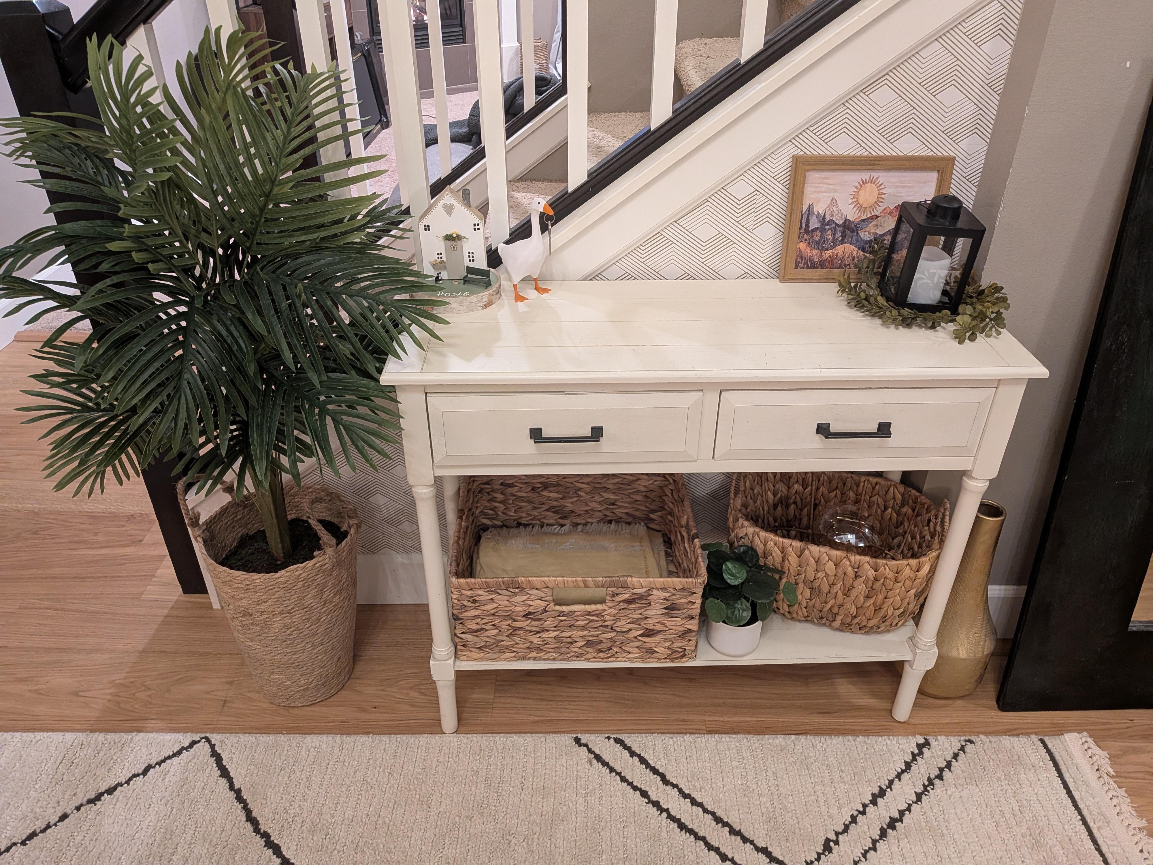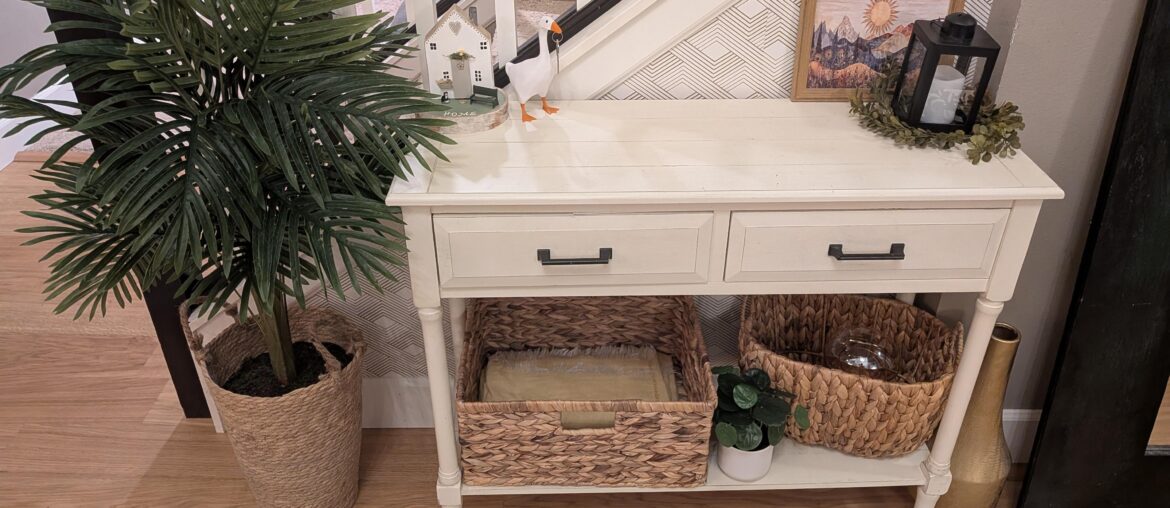
This is the first thing you see when walking into our house and I feel like it's missing the mark. Is the bottom of the table too visually 'heavy'? Should I add a catch tray or leave the middle space empty? Maybe something taller in the triangle corner?
The little house is sentimental so I would like to keep that on the table somewhere, but everything else I can part with.
Any help or advice is appreciated!
by ThisIsTheYam_Jam


25 Comments
It’s the un-matched baskets and the bottom. Get 2 of the same size, so it doesn’t feel disjoined. Also think you can have wicker baskets or the wicker tree pot at the bottom not all 3. Maybe go with a different plant pot to mix things up.
More geese on top!!
I would suggest an eye-catching artwork instead of the small one.
It’s the baskets that are throwing it off. Get two matching ones that fit the space properly.
Can you take a wider shot so we can see the whole area?
But right off the bat, I’d say remove the angled basket at the bottom. Centre the rectangular basket. Put the little plant where the candle and garland is and remove those items. Then see how it feels. I don’t think you need a catch tray as that’s what the drawers are for. But I also think the table may just be a little too big for the space.
It seems a too long and the area too crowded. The wallpaper is nice but I can hardly see it. The mirror to the right seems too close. Then there’s a vase on the floor…why?
I’d get a smaller mirror I can hang and put a table below that. In this area, I’d move the plant to the right and not do anything else at all. The wallpaper and the pretty staircase are enough.
I think the bottom of the table looks a little heavy, yeah. A catch tray in the middle would balance it out, or even a cool basket. Maybe a taller plant in the corner to draw the eye up?
It’s a vibe but it’s more of a “we aimed Airbnb vibe” but I’m not sure what you’re aiming towards? Maybe young modern and slight eclectic touches? Maybe clean modern coastal-but-someone-between-us/ lived-in-a-rural-area-once? It’s something you need to decide, own your style and lean in without anyone but your household in mind!
how about real plants? the faux plants are distracting IMO.
I like it, but this is very my style.
If you don’t like it, the middle basket doesn’t match the other two (the one under the table and the one holding the palm).
It’s low and boxy. Getting one that “fits” better (e.g. two of the same under the table) or making the not-fitting look a bit more intentional (e.g. tallest in the middle, all with rounded edges) would be what I’d go for
A bench would look best there
Too many pieces competing. Slide the table right, let the bench breathe. Two matching baskets underneath, ditch the angled one. Hang the mirror above. Plant in the corner draws the eye and tones down the wicker. Little house stays. 😊
Honestly that’s a weird little spot. Maybe a chair would be better? This little table might look better next to the end of the staircase too, I don’t know.
The table is beautiful. I love it.
Go with the house theme.
Switch places with the table and the bench. The table is too visually heavy for that space and it abuts the Bannister. The lower bench and plant could sit by either one. Or just remove it altogether. You mentioned the little house being sentimental, but everything is shoved into the back 2 corners. Find matching baskets for the shelf. Put a potted plant or a lamp on the table. Or both, along with your cute house.
youre right, its not bad, it just feels a bit bottom-heavy. I’d try either removing one of the baskets or replacing one with something visually lighter, and then adding a slightly taller element on the tabletop to balance the height
Maybe just remove it all together 🤷🏻♀️ and fill the corner with a large/tall plant.
It feels a bit cluttered.
I think the table is too long. Have you considered switching the table and bench? That way you can hang the large mirror on the wall. The proportions would be more appropriate.
OP: where did you get the goose?
Perhaps look at a different pot to put the plant in, even on a little stand to elevate it. You could consider something that repeats the colors in the adjoining room. I feel two or three baskets that are the same would work better in the bottom shelf.
Also add and actual lamp with a shade in place of the lantern.
Yes a little too wide for spot,maybe remove plant and spray table black if those stair rails are black
Dark wood better
Yes.
Also, you have cushions, but shouldn’t feel the need to put them on the bench. It may look and feel better without them. Try it with and without and see which you prefer. If the bench is there for practical reasons, to sit and put on, take off shoes, you don’t actually need the cushions. If it’s just a place to put a piece of furniture you already have, think about whether you actually want something there. It could be a place just for the plant.
Also could consider a taller (real) plant for that particular spot. (I’m not a fan of artificial plants. They collect dust and serve no real purpose.) My 2 cents.
It is just too much stuff there period. I would remove the table and everything on it entirely. Just leave the plant and place it where the stairwell and wall meet. That’s all. Don’t else. Not every empty space needs something. If the table served an important function for the space, then perhaps there are other options or you can just have the table and whatever piece serves that function. Again, you don’t have to fill every space.