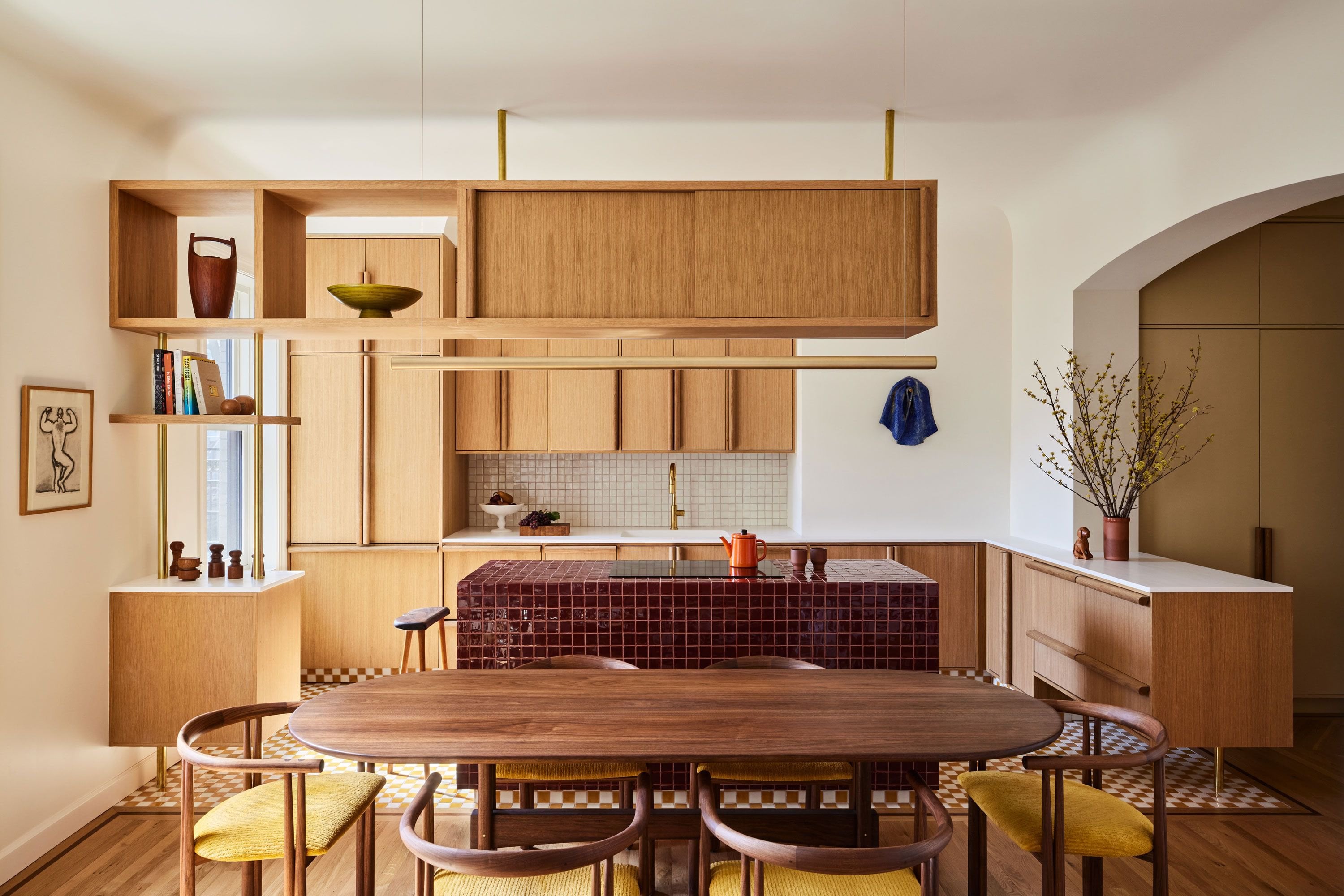
It’s beautiful. I love the use of wood and curves throughout the entire space. While I agree the old bathroom had to go, the new one is not to my taste. I also wish they had found a way to preserve the brick in the living room. I’m not a fan of the bar hanging over the stovetop. It’s distracting and feels cramped. I wasn’t sure about straightening the hallway at first, but I think it was smart to allow more light into the space, and the rounded walls give a nod to the original century design. And I absolutely adore the cabinet and door pulls.
tippythecanoe
Is there a way to prevent the island’s grout from becoming nasty?
Lacan_
While not for everyone’s taste, this is a nice use of mid-century modern furniture throughout the apartment, especially in the living room. The abstract living room painting is too small for the space and draws attention to the fact that something used to be there (the fireplace). Love the built-in bookshelves. The all-tile kitchen island is an unmitigated disaster of decor that doesn’t fit in with the rest of the design, an utter cleaning nightmare (better get a good grout brush), and you are almost certainly gonna break some plates on that if you set them down too hard. Also, do we not believe in range hoods anymore? The dining set is lovely; the hanging light over it is bad because it means your dining room can never be in a different configuration or use a smaller table, otherwise everyone will have to walk around the fixture. The bathroom re-arrangement is great (I’ve lived in a NYC apartment that had the side shower head feature; it sucked). I would have chosen an angled shower head instead of a straight down rain head because it makes it hard to stand in the shower and have shower thoughts. Do not care for the powder room wallpaper.
* Architecture: 6.5/10 – A nice redesign of layout that makes more sense for the space and opens more hallway storage. (Edit: knocking this down from a 9 because, as has been pointed out in the comments, there are no visible outlets in the kitchen, which is unconscionable; I also can’t see an oven, but I will give the benefit of the doubt and assume it’s in the tile-island-of-porous-cross-contamination-and-eventual-mildew). * Decor: 7.2/10 – Would be higher if that ridiculous island was done in any other way than tile. * View: 6/10 – NYC alleyway brick isn’t something you can really avoid, but for the love of God, put up some sheer curtains in the bedroom or something.
powersurge27
Looks a lot like Don Draper’s apartment.
iownsobad
So warm and organic, love it.
TheEquinoxe
Damn, I’d cook in there.
fertdirt
Yes, but are the acoustics in the small office good enough to record our podcast, Only Midcentury in the Building?
Love the wallpaper in the powder, hate the slab selection in main bathroom.
Love the burgundy of the kitchen island, hate everything else about the island. Third-nipple level of uselessness.
Affectionate-Ebb-151
I love everything about this. It’s beautiful.
Leaningonalamp
Not for me. Plus breaks two cardinal rules of mine. No cooktop on island. No grout in house.
mishkamishka47
It’s beautiful, but the kitchen is borderline unusable. Maybe 8 square feet of counter space big enough to do anything, no outlets in sight. I’d be nervous about how even that tile is for using a cutting board, too. And all that 8” counter running along the wall that’s just dead space. Kills me when so much effort and money is used to beautify a space without considering usability.
Bioioooong
I’ve been considering mixing wood stains in my house (because I don’t feel like restraining furniture for eternity or buying new stuff) and this is my new inspiration to just go for it. It’s subtle but not too matchy-matchy. I love it!
JimDiego
No vent above the stove top?
[deleted]
I slid accross to see the reno from the ugly 60s interior. Then I realised this was the reno. Hope you like it because it’s ugly af imo
![Kitchen and dining space in a gut-renovated East Village apartment, Lower Manhattan, New York City [3000x2001]](https://www.ffood.org/wp-content/uploads/2023/08/GXT_UU5LujGM1Hn7zxO4BTP8IgfXbTgnYp44gp93B-M-scaled.jpg "Kitchen and dining space in a gut-renovated East Village apartment, Lower Manhattan, New York City [3000×2001]")

22 Comments
[More pics and information, including some pre-renovation pics and floorplans](https://www.curbed.com/article/120-year-old-east-village-co-op-before-and-after-tour.html). [Designer website with even more pics](https://www.grtarchitects.com/projects/east-village-apartment). I think some people will prefer the bathroom before renovation.
It’s beautiful. I love the use of wood and curves throughout the entire space. While I agree the old bathroom had to go, the new one is not to my taste. I also wish they had found a way to preserve the brick in the living room. I’m not a fan of the bar hanging over the stovetop. It’s distracting and feels cramped. I wasn’t sure about straightening the hallway at first, but I think it was smart to allow more light into the space, and the rounded walls give a nod to the original century design. And I absolutely adore the cabinet and door pulls.
Is there a way to prevent the island’s grout from becoming nasty?
While not for everyone’s taste, this is a nice use of mid-century modern furniture throughout the apartment, especially in the living room. The abstract living room painting is too small for the space and draws attention to the fact that something used to be there (the fireplace). Love the built-in bookshelves. The all-tile kitchen island is an unmitigated disaster of decor that doesn’t fit in with the rest of the design, an utter cleaning nightmare (better get a good grout brush), and you are almost certainly gonna break some plates on that if you set them down too hard. Also, do we not believe in range hoods anymore? The dining set is lovely; the hanging light over it is bad because it means your dining room can never be in a different configuration or use a smaller table, otherwise everyone will have to walk around the fixture. The bathroom re-arrangement is great (I’ve lived in a NYC apartment that had the side shower head feature; it sucked). I would have chosen an angled shower head instead of a straight down rain head because it makes it hard to stand in the shower and have shower thoughts. Do not care for the powder room wallpaper.
* Architecture: 6.5/10 – A nice redesign of layout that makes more sense for the space and opens more hallway storage. (Edit: knocking this down from a 9 because, as has been pointed out in the comments, there are no visible outlets in the kitchen, which is unconscionable; I also can’t see an oven, but I will give the benefit of the doubt and assume it’s in the tile-island-of-porous-cross-contamination-and-eventual-mildew).
* Decor: 7.2/10 – Would be higher if that ridiculous island was done in any other way than tile.
* View: 6/10 – NYC alleyway brick isn’t something you can really avoid, but for the love of God, put up some sheer curtains in the bedroom or something.
Looks a lot like Don Draper’s apartment.
So warm and organic, love it.
Damn, I’d cook in there.
Yes, but are the acoustics in the small office good enough to record our podcast, Only Midcentury in the Building?
Love the wallpaper in the powder, hate the slab selection in main bathroom.
Love the burgundy of the kitchen island, hate everything else about the island. Third-nipple level of uselessness.
I love everything about this. It’s beautiful.
Not for me. Plus breaks two cardinal rules of mine. No cooktop on island. No grout in house.
It’s beautiful, but the kitchen is borderline unusable. Maybe 8 square feet of counter space big enough to do anything, no outlets in sight. I’d be nervous about how even that tile is for using a cutting board, too. And all that 8” counter running along the wall that’s just dead space. Kills me when so much effort and money is used to beautify a space without considering usability.
I’ve been considering mixing wood stains in my house (because I don’t feel like restraining furniture for eternity or buying new stuff) and this is my new inspiration to just go for it. It’s subtle but not too matchy-matchy. I love it!
No vent above the stove top?
I slid accross to see the reno from the ugly 60s interior. Then I realised this was the reno. Hope you like it because it’s ugly af imo
Grout should be sealed. This the highest-rated sealant on Amazon. https://www.amazon.com/AQUA-X-Sealer-Commercial-Mildew-Inhibitor/dp/B07M7L92LW/ref=sxin_15_pa_sp_search_thematic_sspa?adgrpid=1346902312114671&content-id=amzn1.sym.6b029eb3-7d41-4744-b45d-69fe835e098d%3Aamzn1.sym.6b029eb3-7d41-4744-b45d-69fe835e098d&cv_ct_cx=grout+seal&hvadid=84181543767794&hvbmt=be&hvdev=c&hvlocphy=164327&hvnetw=o&hvqmt=e&hvtargid=kwd-84181748699465%3Aloc-190&hydadcr=24665_13493338&keywords=grout+seal&pd_rd_i=B07M7L92LW&pd_rd_r=9c4c07aa-5581-40c2-b965-0859eb062e62&pd_rd_w=kQGgS&pd_rd_wg=XpWZ7&pf_rd_p=6b029eb3-7d41-4744-b45d-69fe835e098d&pf_rd_r=2EW5T1C6Z37DKT58D499&qid=1665692835&qu=eyJxc2MiOiI0LjIzIiwicXNhIjoiMy45OCIsInFzcCI6IjMuNzUifQ%3D%3D&sr=1-1-a73d1c8c-2fd2-4f19-aa41-2df022bcb241-spons&psc=1
Beautiful space. Love the cohesiveness. Been seeing a lot of camel / browns / beige lately. Hope it doesn’t get beat to the ground like grey.
Very nice
Like the warm and mid century vibes created by the wood pieces but that ceiling cabinet kills the flow a bit.
The flooring and red island is absolutely hideous.
Stunning!!
Looks strangely like a 1950s house but newer, very cool
I don’t get the 60’s vibe.