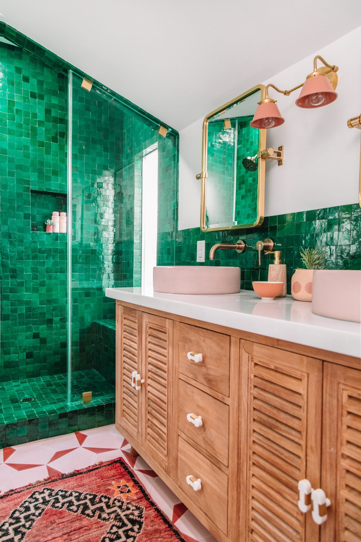
This isn’t perfect (the choice of pinks to offset the green is not good, and the floor is wrong for it too) but so many points for those beautiful green tiles. That shower is delightful.
Also I just bloody appreciate seeing some colour in a bathroom, even if they got it wrong for my taste. I’m so over boring (monochromatic B&W or the ultimate cop-out: tame ‘calming’ greige). I love that they went there. I hope the owners adore it!
NeoTheUnchosenOne
Give me that GitHub vibe. “I got you fam.”
monkey_trumpets
That is definitely green
DeTrotseTuinkabouter
The soft pink seems like a poor choice. I would have gone for white.
sputnikspiff
I don’t like it.
Napple164
My favorite color is green and I hate this.
yellowdragonteacup
I absolutely love the bright green emerald tiles. I get so frustrated with all these white or neutral coloured rooms that everyone thinks are so great… they’re boring in my opinion, and I have never understood the appeal when there is an entire rainbow of colours out there that are far, far prettier!
Unfortunately that’s about all that I like in this bathroom. To start with, it has already dated and they only just finished building it. That green and pink colour scheme has been done to death these past couple of years, it is everywhere. Before I read some of the other comments on this post I had thought that I might be the only person who doesn’t like it. I really don’t. This bathroom is a great demonstration of why.
Also, those tiles say to me that they are more modern/glam style, so I’m not sure why they decided to take the rest of the room in the direction they did. I don’t even know the name of this style, just that it’s completely wrong.
I don’t like that vanity either. If it were me, I would have actually kept the old one and re-stained it a darker brown shade. The handles on this one are wrong as well, and don’t get me started on how the floor and that rug clash with the tiles.
That said, the glass door with the gold clamps, the gold mirrors, tapware and the finishes on the wall lights are a good choice. Keep those, just get rid of the lampshades, the basins, the vanity and the floor.
I would have done the floor in a square or rectangular patterned tile in a smaller size than the shower tiles (maybe even penny rounds?) using white with the odd scattered black and gold tile to break up the large expanse of white and add colour that would complement, not fight against, the green. Add back in the re-stained old vanity as I mentioned above, swap out the basins for white (or maybe a pastel gold/yellow colour, or another green that tones with, but is not as bright as the shower walls) and put some clear shades on the wall lights.
A plain black bathmat on the floor, and completely different wall art (in bright peacock colours) on the back wall next to the loo, and you would have a much better room.
RedBerrees
Love the tiles but I feel like the cupboards underneath the sink should match the same feeling of boldness. The bleak pale wood just washes out behind how overwhelmingly green the tiles are.
titsandtoots
I love emerald, and I love coral pink. But I do not love them together. This isn’t working for me.
Specific_Pudding
How much would a tile work like this cost? It’s so nice
Existing-Technology
I love it but I wonder how dated it’ll look in 10 years.
jakethedog53
I’m getting The Shining vibes.
Connect_Office8072
My 1st thought when I saw this was, “My God, it’s Emerald City.” Then I realized that it’s a bathroom – so disappointed. Still, love the green tiles.
[deleted]
Oh my god it’s stunning. I am physically reacting to it. Yeeeeeeesh. Beautiful.
[deleted]
I feel like it would look better with dark brown or black walls
Technical-Net-9435
If I click my heels 3 times while inside of it, do I go home?
AbstractHoloFractal
Happy villager noises
im_not_danny_devito
I don’t mind the green tiles against the pink floor and sinks, for me it’s the wooden cabinets that don’t fit.
HUD361
dopeAF
CynicalBite
Offs I just spent 30k to get RID of this colour. My head hurts.
JRiggles
Impressive commit history
winterbird
The green tile is a showstopper. It’s like Kiera Knightley’s atonement dress shape-shifted into a shower stall.
The floor is inexcusable. At least the runner is covering most of it here.
The cabinet and counter are fantastic. Clean and natural, holding their own but not detracting from those amazing green tiles.
I would change the knobs though. At first glance I wondered why child proof pull tabs weren’t removed for the photo shoot. One of those tetragonal shape gem cabinet pulls would have been perfect. They come in many color choices for the gem and often incorporate gold tones.
The bowl sinks and light fixtures are a desperate attempt to look cool and young. Those were neat for about two months in 2021. Not too worried about adding these gimmicks in the form of easily changeable accessories like the light fixture shades, but I’d think twice about doing it with sinks.
I’m wishing the mirror was the same finish as the faucet.
BrushedSpud
I feel it’s trying too hard to be matchy matchy in colour. I feel the baskets cheapen it. The artwork has been chosen just because it’s green and coral. It was close but just somehow lost its way.
SmallShrubbery
This is frickin gorgeous. I would feel like a Mayan queen in that shower.
bgj556
I’m usually not one to comment, but this is super nice.
Dry___wall
1000% better than subway tiles
I love it all besides the sconce, that thing is ugly. And maybe the mirrors (they’re just okay) and counter accessories. Thank baby Jesus they covered the floor with a nice rug. If they decorated any other way than what they did the floor wouldn’t work.
Daisydoolittle
give credit where it’s due OP. this is @studiodiy
[deleted]
Your shampoo and conditioner are my favourites 🙂 also I love the green and peach combination! I’d probably make the floor tile a bit more simple and more toned in though.
thatdinklife
I like everything here, but don’t like any of it together.

33 Comments
[More pics and information, including pics before the renovation](https://studiodiy.com/the-mindwelling-our-master-bathroom-reveal//). Honestly the bathroom from before is unrecognizable. There are more posts showing the rest of the house from the blog.
I LOVE this. Give me all the green!!!
Love the anthro tile in the floor.
i love everything but the floor, it looks off.
This isn’t perfect (the choice of pinks to offset the green is not good, and the floor is wrong for it too) but so many points for those beautiful green tiles. That shower is delightful.
Also I just bloody appreciate seeing some colour in a bathroom, even if they got it wrong for my taste. I’m so over boring (monochromatic B&W or the ultimate cop-out: tame ‘calming’ greige). I love that they went there. I hope the owners adore it!
Give me that GitHub vibe. “I got you fam.”
That is definitely green
The soft pink seems like a poor choice. I would have gone for white.
I don’t like it.
My favorite color is green and I hate this.
I absolutely love the bright green emerald tiles. I get so frustrated with all these white or neutral coloured rooms that everyone thinks are so great… they’re boring in my opinion, and I have never understood the appeal when there is an entire rainbow of colours out there that are far, far prettier!
Unfortunately that’s about all that I like in this bathroom. To start with, it has already dated and they only just finished building it. That green and pink colour scheme has been done to death these past couple of years, it is everywhere. Before I read some of the other comments on this post I had thought that I might be the only person who doesn’t like it. I really don’t. This bathroom is a great demonstration of why.
Also, those tiles say to me that they are more modern/glam style, so I’m not sure why they decided to take the rest of the room in the direction they did. I don’t even know the name of this style, just that it’s completely wrong.
I don’t like that vanity either. If it were me, I would have actually kept the old one and re-stained it a darker brown shade. The handles on this one are wrong as well, and don’t get me started on how the floor and that rug clash with the tiles.
That said, the glass door with the gold clamps, the gold mirrors, tapware and the finishes on the wall lights are a good choice. Keep those, just get rid of the lampshades, the basins, the vanity and the floor.
I would have done the floor in a square or rectangular patterned tile in a smaller size than the shower tiles (maybe even penny rounds?) using white with the odd scattered black and gold tile to break up the large expanse of white and add colour that would complement, not fight against, the green. Add back in the re-stained old vanity as I mentioned above, swap out the basins for white (or maybe a pastel gold/yellow colour, or another green that tones with, but is not as bright as the shower walls) and put some clear shades on the wall lights.
A plain black bathmat on the floor, and completely different wall art (in bright peacock colours) on the back wall next to the loo, and you would have a much better room.
Love the tiles but I feel like the cupboards underneath the sink should match the same feeling of boldness. The bleak pale wood just washes out behind how overwhelmingly green the tiles are.
I love emerald, and I love coral pink. But I do not love them together. This isn’t working for me.
How much would a tile work like this cost? It’s so nice
I love it but I wonder how dated it’ll look in 10 years.
I’m getting The Shining vibes.
My 1st thought when I saw this was, “My God, it’s Emerald City.” Then I realized that it’s a bathroom – so disappointed. Still, love the green tiles.
Oh my god it’s stunning. I am physically reacting to it. Yeeeeeeesh. Beautiful.
I feel like it would look better with dark brown or black walls
If I click my heels 3 times while inside of it, do I go home?
Happy villager noises
I don’t mind the green tiles against the pink floor and sinks, for me it’s the wooden cabinets that don’t fit.
dopeAF
Offs I just spent 30k to get RID of this colour. My head hurts.
Impressive commit history
The green tile is a showstopper. It’s like Kiera Knightley’s atonement dress shape-shifted into a shower stall.
The floor is inexcusable. At least the runner is covering most of it here.
The cabinet and counter are fantastic. Clean and natural, holding their own but not detracting from those amazing green tiles.
I would change the knobs though. At first glance I wondered why child proof pull tabs weren’t removed for the photo shoot. One of those tetragonal shape gem cabinet pulls would have been perfect. They come in many color choices for the gem and often incorporate gold tones.
The bowl sinks and light fixtures are a desperate attempt to look cool and young. Those were neat for about two months in 2021. Not too worried about adding these gimmicks in the form of easily changeable accessories like the light fixture shades, but I’d think twice about doing it with sinks.
I’m wishing the mirror was the same finish as the faucet.
I feel it’s trying too hard to be matchy matchy in colour. I feel the baskets cheapen it. The artwork has been chosen just because it’s green and coral. It was close but just somehow lost its way.
This is frickin gorgeous. I would feel like a Mayan queen in that shower.
I’m usually not one to comment, but this is super nice.
1000% better than subway tiles
I love it all besides the sconce, that thing is ugly. And maybe the mirrors (they’re just okay) and counter accessories. Thank baby Jesus they covered the floor with a nice rug. If they decorated any other way than what they did the floor wouldn’t work.
give credit where it’s due OP. this is @studiodiy
Your shampoo and conditioner are my favourites 🙂 also I love the green and peach combination! I’d probably make the floor tile a bit more simple and more toned in though.
I like everything here, but don’t like any of it together.