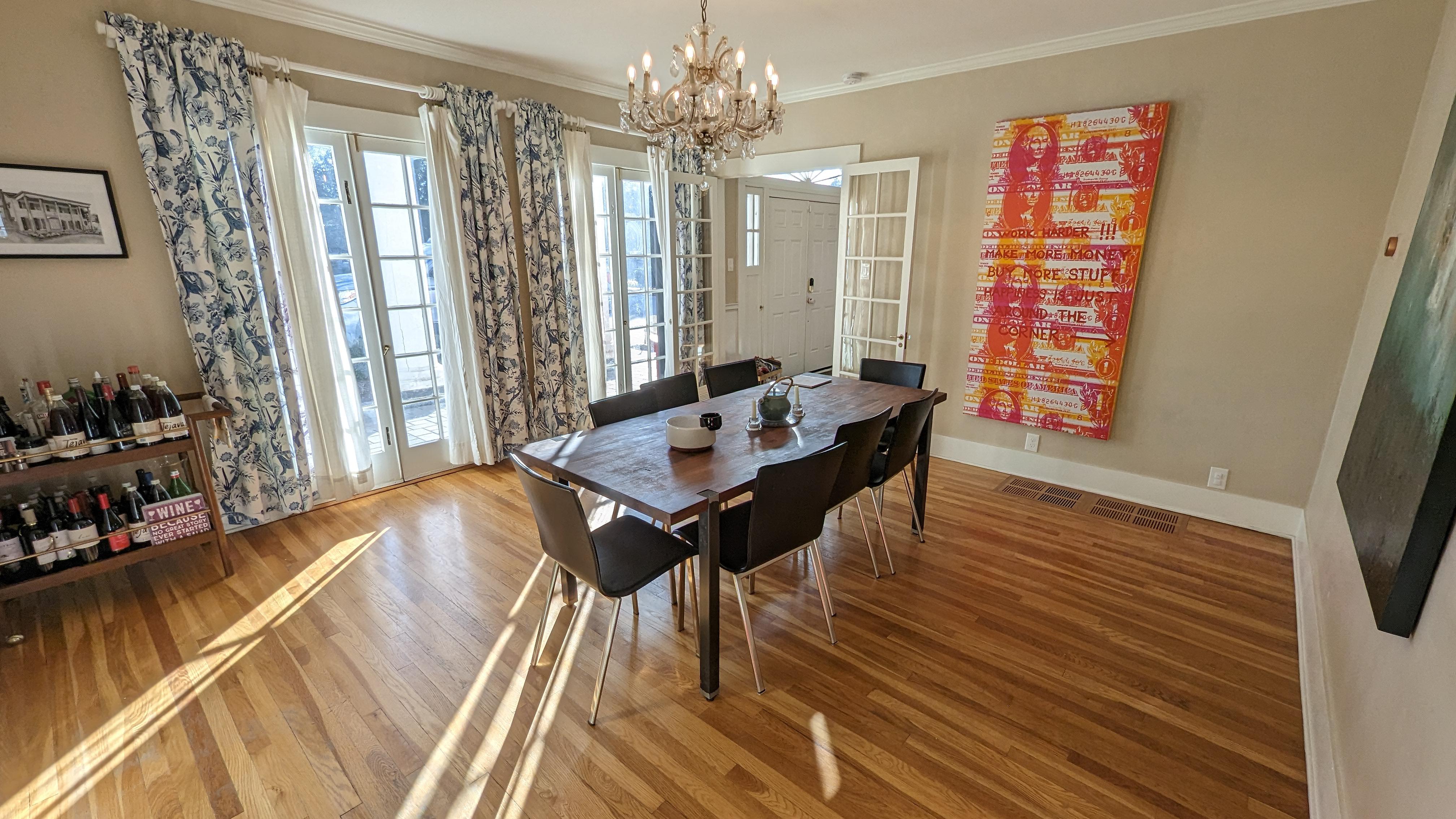
That neon colored “Work Harder, Make more money, Buy more stuff” painting really clashes with the rest of the room.
Rakebleed
The placement of your table is giving me r/mildlyinfuriating vibes just off center with the chandelier. Great lighting!
shitbiochemist
Why tejava
[deleted]
That dollar bill poster art thing is cringe
jeanralphia
Great natural light!
Etoile_delanuit
Such a lovely large room, and such a tiny dining table. Great lighting though !
kittyflaps
Great light! Now put some plants up in this bitch!! 🪴
[deleted]
r/amateurroomporn exists for posts like these.
MrFallacious
This room is too empty for my tastes and just seems a little uncomfy
Ahy_Jay
Looks so cozy
milliamu
No two pieces match, the chandelier clashes with everything, the art is questionable at best and it’s all either too large or too small for the space.
I love it.
This is what a home is meant to be, not curated with a razor to exactly match some preordained aesthetic, certainly not a temple.
It’s a collection of things you love in a space you call home.
It’s perfect.
mars_probe
Here we’ve got a beautiful colonial style room with French doors and white walls, crown molding, nice wood floors and quiet, muted colors: A perfect space for eating, drinking and relaxing.
And yet we also have busy blue printed curtains, a loud canvas with a modern art (already misplaced in this room) depicting orange dollar bills that looks like it was purchased in the Home Decor section of [insert big box retailer here]. There is also a table set with (black?!) plastic chairs that is too small for the space.
OP, you’ve got what looks like a beautiful house. Congrats! There’s a decent painting on the near wall. Find some solid color curtains to match this painting (maybe lighter turquoise or navy), remove the orange dollar bill monstrosity, upgrade the table and chairs and this will be ready for r/roomporn.
Sly3n
Sorry, but I don’t see any room porn here. The room has no cohesive design. Everything in the room just looks random and like a hodge podge of stuff. That dollar bill art work is plain awful. The table is too small for the space. The space needs an area rug. The alcohol area is meh…and that wine sign is 👎.
mel_fal
I think an area rug under the table would be good. And some plants
leeloodallas502
“Wine, because no good story ever started with a salad” sign is the new “live, love, laugh”.
berlage1856
Honestly, take some time and study the photos in this sub. You should be able to see that your room is not at the same level. Not everyone can become a famous designer, but there’s no inherent reason you can’t learn how to make your room beautiful. It’s not really about money, it’s about knowledge and having a good eye.

![Really lovely natural light in our dining room in the winter [OC] [3438x1934]](https://www.ffood.org/wp-content/uploads/2023/08/vteq7hyydpaa1-scaled.jpg "Really lovely natural light in our dining room in the winter [OC] [3438×1934]")
16 Comments
That neon colored “Work Harder, Make more money, Buy more stuff” painting really clashes with the rest of the room.
The placement of your table is giving me r/mildlyinfuriating vibes just off center with the chandelier. Great lighting!
Why tejava
That dollar bill poster art thing is cringe
Great natural light!
Such a lovely large room, and such a tiny dining table. Great lighting though !
Great light! Now put some plants up in this bitch!! 🪴
r/amateurroomporn exists for posts like these.
This room is too empty for my tastes and just seems a little uncomfy
Looks so cozy
No two pieces match, the chandelier clashes with everything, the art is questionable at best and it’s all either too large or too small for the space.
I love it.
This is what a home is meant to be, not curated with a razor to exactly match some preordained aesthetic, certainly not a temple.
It’s a collection of things you love in a space you call home.
It’s perfect.
Here we’ve got a beautiful colonial style room with French doors and white walls, crown molding, nice wood floors and quiet, muted colors: A perfect space for eating, drinking and relaxing.
And yet we also have busy blue printed curtains, a loud canvas with a modern art (already misplaced in this room) depicting orange dollar bills that looks like it was purchased in the Home Decor section of [insert big box retailer here]. There is also a table set with (black?!) plastic chairs that is too small for the space.
OP, you’ve got what looks like a beautiful house. Congrats! There’s a decent painting on the near wall. Find some solid color curtains to match this painting (maybe lighter turquoise or navy), remove the orange dollar bill monstrosity, upgrade the table and chairs and this will be ready for r/roomporn.
Sorry, but I don’t see any room porn here. The room has no cohesive design. Everything in the room just looks random and like a hodge podge of stuff. That dollar bill art work is plain awful. The table is too small for the space. The space needs an area rug. The alcohol area is meh…and that wine sign is 👎.
I think an area rug under the table would be good. And some plants
“Wine, because no good story ever started with a salad” sign is the new “live, love, laugh”.
Honestly, take some time and study the photos in this sub. You should be able to see that your room is not at the same level. Not everyone can become a famous designer, but there’s no inherent reason you can’t learn how to make your room beautiful. It’s not really about money, it’s about knowledge and having a good eye.