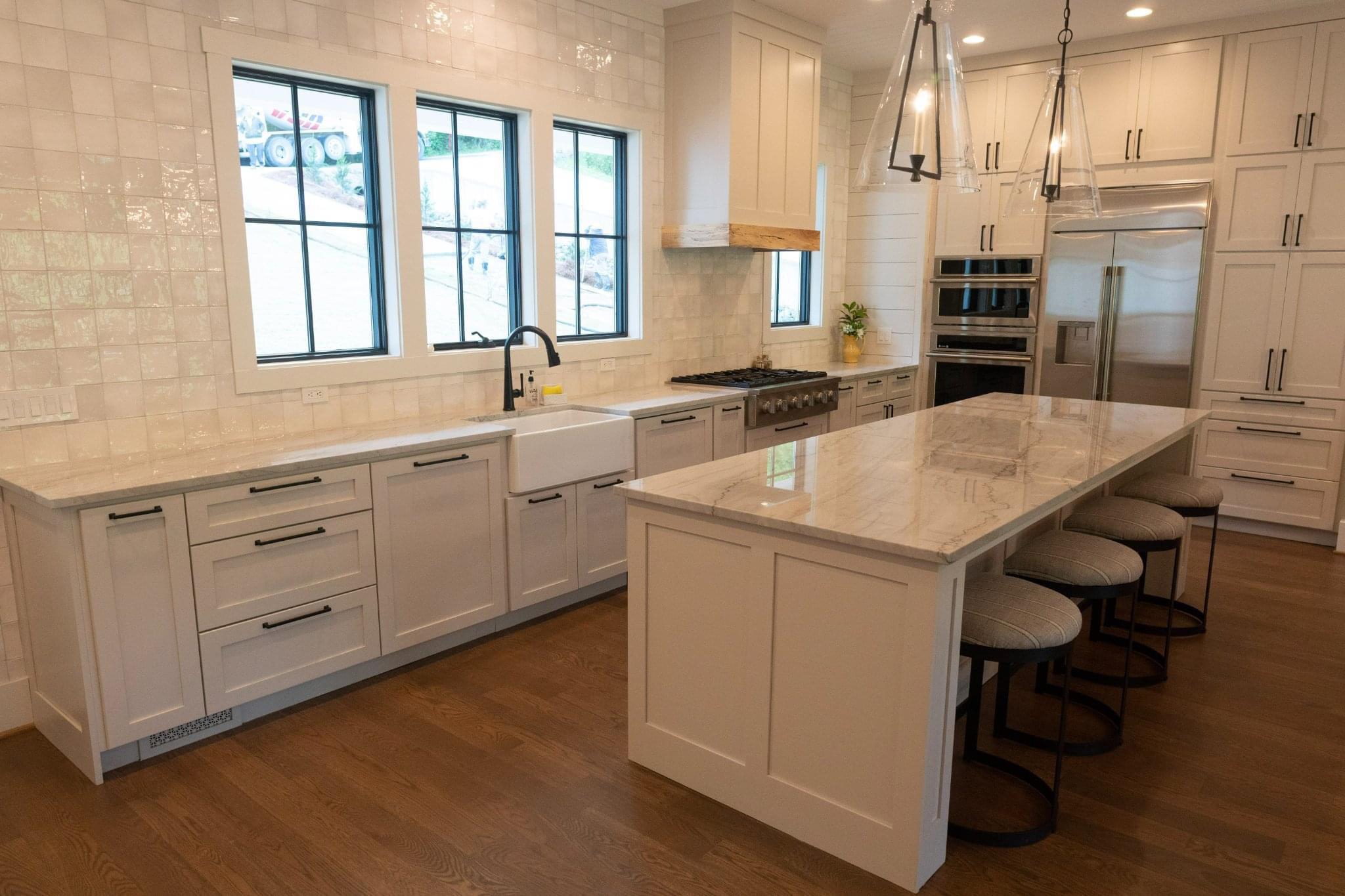
Wayyyyyyy too much tile, and sterile-looking.. Looks almost like a hospital
Skyris3
Boring enough ?
wolpertingersunite
I would love to see this kind of design in actual use. Once there’s just one box of cereal on the counter, or one coffee mug, doesn’t that wreck the whole aesthetic? Now the whole room is just a white frame for the cereal box as focal point.
winterbird
I like the clean and bright look, I like clear counters and this sort of a “not lived in” look (as people tend to describe it). That’s what the storage space is for, to put stuff away.
What’s off about this kitchen in particular is that it’s weighed on one side. Everything’s on the right, and then this unfinished looking end on the left with just a length of counter and a tile wall. I guess we’d have to see the whole space to decide if it was the best choice.
wykdtr0n
Not really a fan of the hardware at the top of the cabs, but I do like the white shakers and those pendants.
Senecus_HS
Looks like a sterile butcher place
OceanIsVerySalty
Wow, a white shaker kitchen with white tile, marble counters, black hardware, and an apron sink. There’s even some shiplap and a natural wood detail on the range hood. It’s just *so* original.
I mean honestly, can’t kitchens have *some* personality. This look is seriously overdone at this point.
Another_Russian_Spy
You would think they could have come up with a better layout, instead of everything jammed together in the corner.
nowwithaddedsnark
The wall tiles are nice and I’m still a sucker for a farmhouse/apron sink. Plus I appreciate an integrated dishwasher, which we don’t see enough of.
The windows limit where the oven could go but I think the cabinet above was a mistake – combined with that heat end it makes it feel plonked in the space. A canopy hood would have worked better.
The counter end bothers me and makes me want a return, and maybe some open shelves above them to break up that tile.
A space this big needs some variation of colour and cabinets and it feels s bit more like a show home than a space that’s easy to work in. The flow between sink, cooktop, oven and fridge doesn’t make sense to me, and it’s all hard edges. But then we can’t see it’s context so…
GabbyWic
I think this kitchen picture is premature. I envision color being added. Plants, fruit, art, pets… like my kitchen! I like the light fixtures with the hardware. All white is not my style, but I think this could be lived in VERY easily!

10 Comments
Wayyyyyyy too much tile, and sterile-looking.. Looks almost like a hospital
Boring enough ?
I would love to see this kind of design in actual use. Once there’s just one box of cereal on the counter, or one coffee mug, doesn’t that wreck the whole aesthetic? Now the whole room is just a white frame for the cereal box as focal point.
I like the clean and bright look, I like clear counters and this sort of a “not lived in” look (as people tend to describe it). That’s what the storage space is for, to put stuff away.
What’s off about this kitchen in particular is that it’s weighed on one side. Everything’s on the right, and then this unfinished looking end on the left with just a length of counter and a tile wall. I guess we’d have to see the whole space to decide if it was the best choice.
Not really a fan of the hardware at the top of the cabs, but I do like the white shakers and those pendants.
Looks like a sterile butcher place
Wow, a white shaker kitchen with white tile, marble counters, black hardware, and an apron sink. There’s even some shiplap and a natural wood detail on the range hood. It’s just *so* original.
I mean honestly, can’t kitchens have *some* personality. This look is seriously overdone at this point.
You would think they could have come up with a better layout, instead of everything jammed together in the corner.
The wall tiles are nice and I’m still a sucker for a farmhouse/apron sink. Plus I appreciate an integrated dishwasher, which we don’t see enough of.
The windows limit where the oven could go but I think the cabinet above was a mistake – combined with that heat end it makes it feel plonked in the space. A canopy hood would have worked better.
The counter end bothers me and makes me want a return, and maybe some open shelves above them to break up that tile.
A space this big needs some variation of colour and cabinets and it feels s bit more like a show home than a space that’s easy to work in. The flow between sink, cooktop, oven and fridge doesn’t make sense to me, and it’s all hard edges. But then we can’t see it’s context so…
I think this kitchen picture is premature. I envision color being added. Plants, fruit, art, pets… like my kitchen! I like the light fixtures with the hardware. All white is not my style, but I think this could be lived in VERY easily!