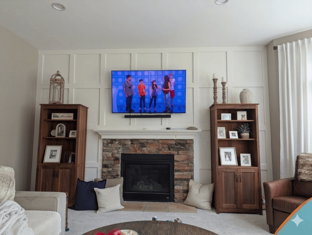
Tv is too high and should not be over a fireplace.
Educational_Bed5284
I hate 3 , 1 or 2 looks better
Ok-Anxiety7263
The second one
MountainStateOfMind
2 looks great
Scary-Hovercraft8214
2nd looks nice!
the_bipolar_bear
2 👍
Known_Measurement799
I like the first one better. Why? There’s already a lot going on on that wall.
Ok-Fondant5026
2 for sure.
lyta_hall
r/tvtoohigh
haf2go
Those two bookcases would look better placed together somewhere else. They fill the spaces in the most awkward of ways. Just too small, making the proportions all off. Adding texture with wood or brick won’t change that.
plantjeee
Might as well mount the tv to the ceiling
zombiemockingbird
Number 1. The other two are too busy.
phatideas
2
Substantial_Air8047
Removing the bookshelves would help. They’re too small
Calbebes
Board and batten. Shiplap is terrivle
Brian18639
1
Life-Wealth-3399
I am partial to number 2. Not a fan of 3 at all.
cwk1844
Three looks not so good, but if it is actually how your wall looks now, I bet it would look a million times better repainted and not weathered/antiqued.
Once you get that outta the way, let’s talk built-ins and move those bookshelves elsewhere!
Purple-Quantity-6441
Definitely the 2nd option. And I agree with the bookshelves making the space feel off. You need either more height on either side of the fire place or something that sits below the level of the mantle to change the way the space feels.
lollykopter
2 without the bookshelves
Beautiful-Night2456
I would do the plain wall, move the TV and the shelves, maybe put the shelves next to each other somewhere else and of course tvtoohigh has its own sub where this room belongs. Then I would add art and plants. It is a nice room with great potential. If you start doing all that trim work it looks odd when the rest of the house doesn’t match that style. You should make the focus to be on some fabulous paintings, vases or small sculptures, plants and the lovely fireplace.
zbornakssyndrome
2
SeekersWorkAccount
1.
2 has too many competing rectangles, it’s way too busy.


23 Comments
Tv is too high and should not be over a fireplace.
I hate 3 , 1 or 2 looks better
The second one
2 looks great
2nd looks nice!
2 👍
I like the first one better. Why? There’s already a lot going on on that wall.
2 for sure.
r/tvtoohigh
Those two bookcases would look better placed together somewhere else. They fill the spaces in the most awkward of ways. Just too small, making the proportions all off. Adding texture with wood or brick won’t change that.
Might as well mount the tv to the ceiling
Number 1. The other two are too busy.
2
Removing the bookshelves would help. They’re too small
Board and batten. Shiplap is terrivle
1
I am partial to number 2. Not a fan of 3 at all.
Three looks not so good, but if it is actually how your wall looks now, I bet it would look a million times better repainted and not weathered/antiqued.
Once you get that outta the way, let’s talk built-ins and move those bookshelves elsewhere!
Definitely the 2nd option. And I agree with the bookshelves making the space feel off. You need either more height on either side of the fire place or something that sits below the level of the mantle to change the way the space feels.
2 without the bookshelves
I would do the plain wall, move the TV and the shelves, maybe put the shelves next to each other somewhere else and of course tvtoohigh has its own sub where this room belongs. Then I would add art and plants. It is a nice room with great potential. If you start doing all that trim work it looks odd when the rest of the house doesn’t match that style. You should make the focus to be on some fabulous paintings, vases or small sculptures, plants and the lovely fireplace.
2
1.
2 has too many competing rectangles, it’s way too busy.
3 is just ugly, sorry