
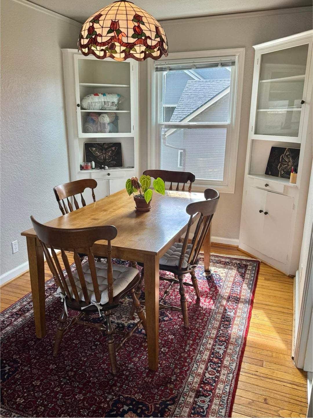
Just picked up this absolutely gorgeous handmade wool Persian rug today from marketplace ($150!), and the only place it fits in our apartment is the dining room.
Personally I think it’s perfect since it fills the space better, adds some interest, is timeless, and also will match the rug in the living room (same style, also picked up today).
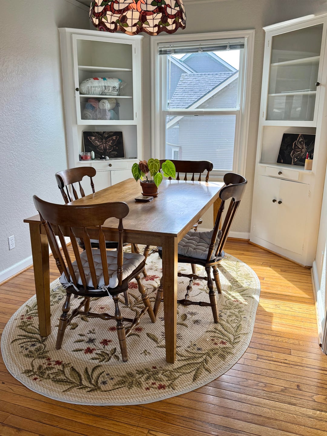
My girlfriend is attached to the second rug though, it’s the one we got when we first moved in. For me it was always just a placeholder since it’s very small and cheaply made. But I also love my girlfriend and want her to be happy. I do think the shape is adorable for the space.
So, from an unbiased perspective and a purely design standpoint, which one do you all think looks better?
by nodesandwhiskers
33 Comments
I think the first fits the light fixture better. The size is also better-
Is there anywhere else the second rug can be used in the home?
2 omg its perfect and brightens it up sm
Second one! Nice airy cozy vibes!
2!!!
I like the first one 🙂
I love #1! Second is way too small.
1. No contest. Timeless
The first one. Larger and gives more color to the room. It is a stunning rug.
2
I think 1 is too dark
The second one looks better to me. It will also protect the floors.
2
2. Very light and cozy.
2!
first. white rug under a table that you’ll be eating at is an accident waiting to happen.
i also think the second one is awkwardly small compared with the size of the room and table
Beige is better in mho. It just needs to be larger. The red one it dated.
2 with this setup BUT 1 goes way better with the lamp imo, just not the table and chairs.
My vote is to keep rug 1 but swap the furniture bc the lamp/rug combo is lovely
1.
i like the colors more on two, but its way too small. number one fits better.
1 is perfect. 2 is cute but too small.
Rug one, but I may be biased because I have an antique one that is very similar.
2! Blends in well with your dining room. It adds the finishing touch.
I like 2! It brightens the room, even if it’s on the smaller side. Where’d you get it?!
Def 2!
I like the color of 1 and the shape of 2
#1!!!
I prefer the second one, but maybe slightly larger. Love the natural light in here!
2, easily. 1 is far too dark.
I’d go with the first.
I like the SHAPE and color scheme of the second one, but that’s literally it. I don’t like the texture of rugs like that for both appearance and texture reasons, the longer I look at it the more it reminds me of Christmas, the size is cute for the space but awkward for the size of the dining table, I personally wouldn’t want white/cream/light colors ANYWHERE NEAR my dining table.
I’m a big fan of rustic and moody colors. I think the first rug gives dimension to an otherwise plain and light room. Where rug two had dimension with shape this has more dimension with color. I think it makes the wood table look much brighter and ties in the chandelier you guys have very well. Although rug two also has matching colors with the chandelier I don’t feel the style of it matches as much as rug one. The room also has more of a golden appearance with rug one as opposed to rug two which I think is what is helping the table shine.
The red looks like better quality but the cream looks brighter, although the time of day or position of the sun could be doing that. Get a better quality cream rug.
1. Fits the space better, timeless, goes with your lamp and you can have all dining chairs on the rug even when the chairs are pulled out!
1. 2 is too small.
I like 1. 2 is too small and when the chairs are pulled out they would sit halfway on and halfway off the rug. Also 1 is more forgiving if food is dropped.
1 is timeless. Seems to make the plant and lamp pop. Also adds a much needed color to the space! The 2nd is pretty on its own but looks cheap and awkwardly small to me.