
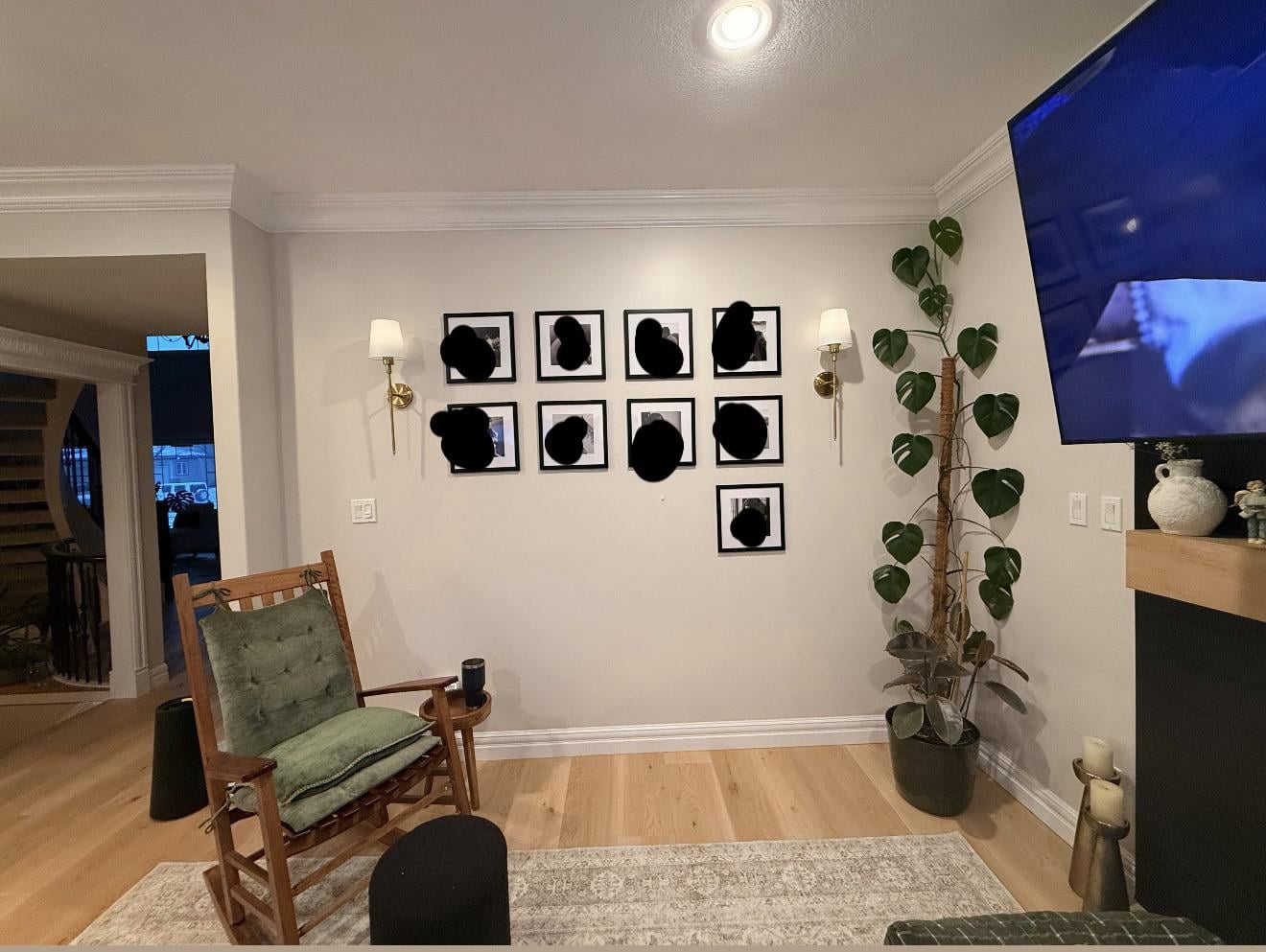
I need some design help with this wall above our mantle — I can’t tell if I’ve just stared at it too long or if it’s actually off 😅
Right now it’s a gallery wall with two rows of frames and sconces on either side, but it’s feeling a bit awkward/empty to me. I’m not sure if it’s:
• the spacing between the two rows

• the overall height of the frames

• or the relationship between the frames and the sconces
Part of me thinks everything should go higher, but then I wonder if the sconces are what’s throwing it off and should come down instead?
We also have a baby, so my husband is thinking long-term that the lower frames might end up being too easy to grab once he’s older — so that might be a reason to raise everything.
A couple things that will be changing:
• the plant in the corner is going

• we’re planning to add floating shelves on the other side of the mantle
Would you:
• keep the two-row layout or simplify it?

• go higher with everything?

• adjust the sconces instead?

• or scrap this and do something totally different?
Be honest — I can take it 🙃
by DepartureCurious2627
7 Comments
First of all, do something about that bottom frame!
This would look great if it was 3 rows. Maybe if you use the cheap plastic frames/plastic “glass” and secure them to the wall super strongly you’d be fine.
Personally I would do some art or something here just because repeating photos like that can be a lot visually. Maybe like large woven plate/bowls, quilt hanger and quilt, or just a single large canvas
Why would you not do 3×3
I think the photo grid you have going on is fine what’s throwing it off is the wall scones being higher than the visual zone of the gallery wall and it feels slightly disconnected bringing them down lower if possible would be better
Little variety = dull.
I don’t see a mantle on that wall…
What kind of plant is this?