
// Firstly please be gentle, i've never had a good eye for interior decorating. Secondly, i hope it's ok i used AI to visualize the results.
Hey all. Doing up the kitchen and we've pretty much chosen everything except for the backsplash.
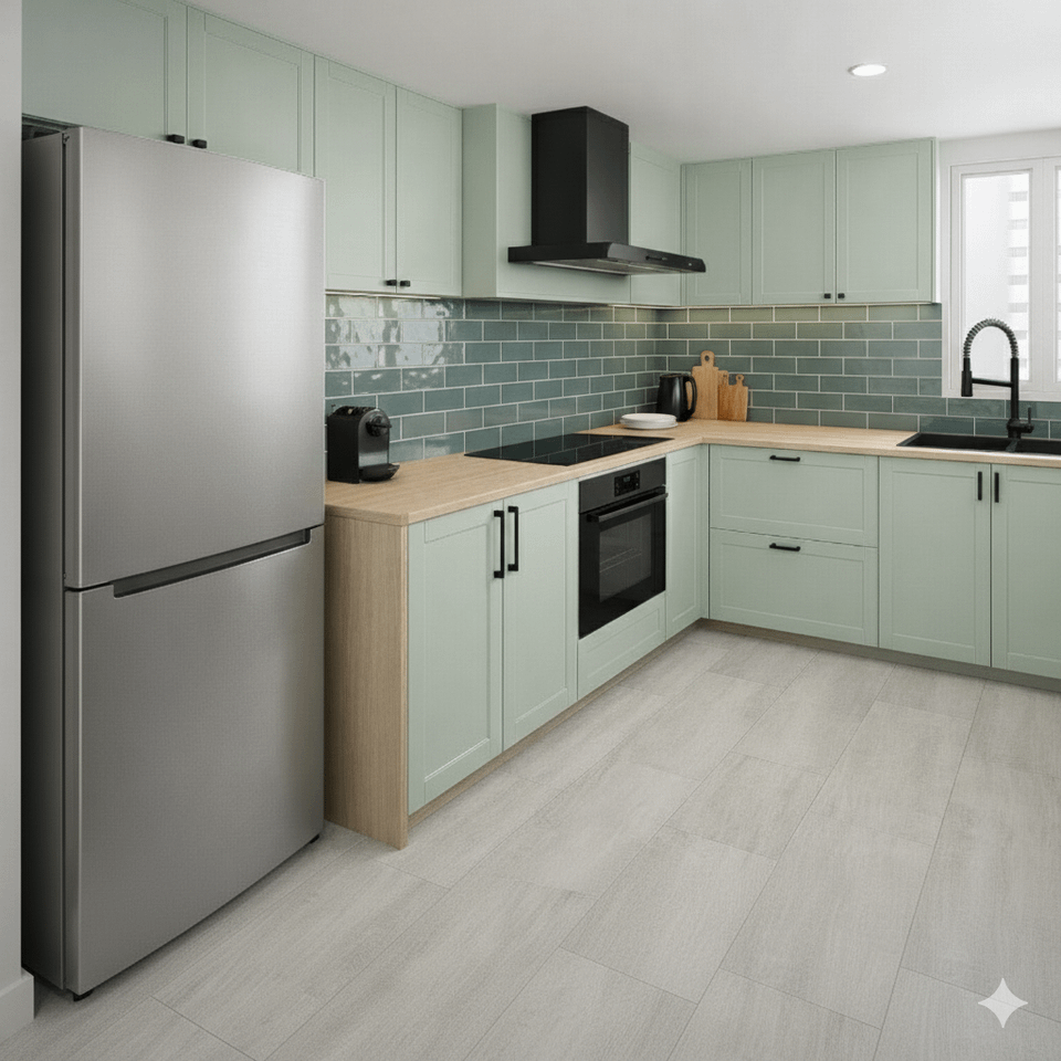
Fell in love with 1 (the dark green) BUT was advised that it was not practical because of the many grout lines (more maintenance required).
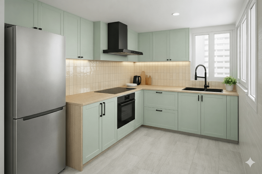
2 has the same effect visually but they are more practical. These tiles are actually 60x30cm, so there will be less grout lines. Sadly they didn't come in the green.
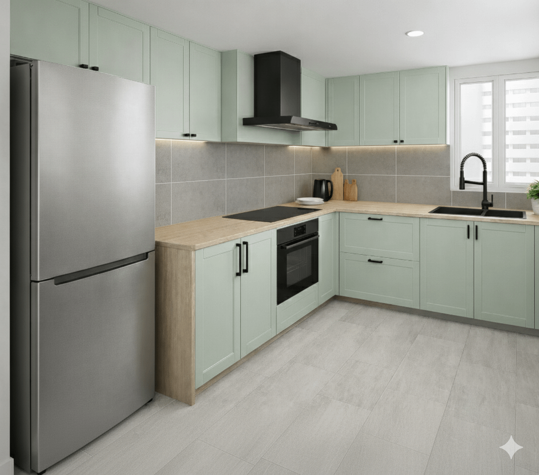
3 is the biggest tile, 60×60, most practical, but somehow i felt i preferred glossy tiles (3 is matte).
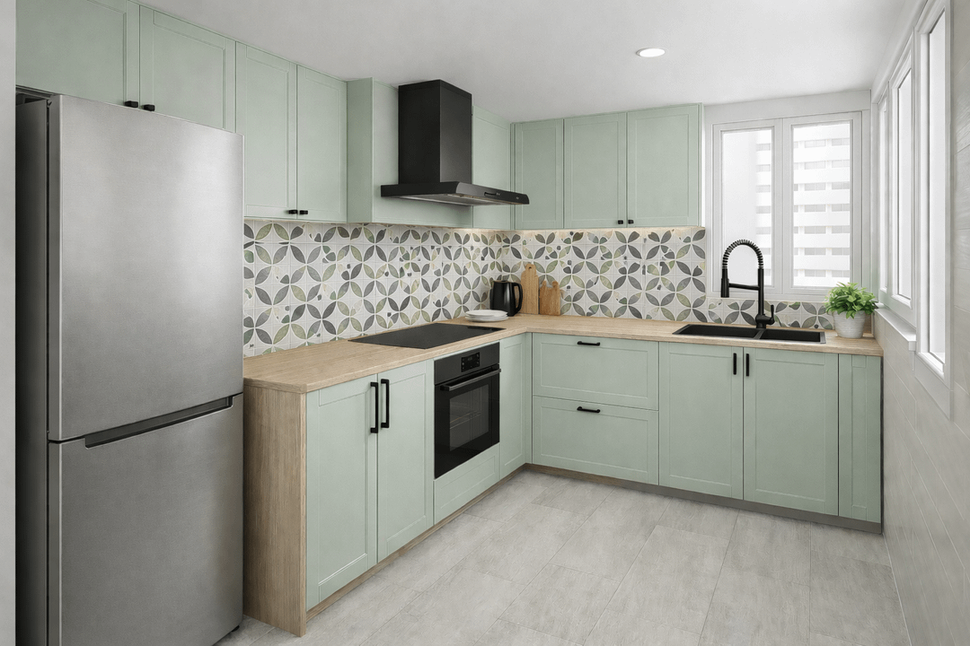
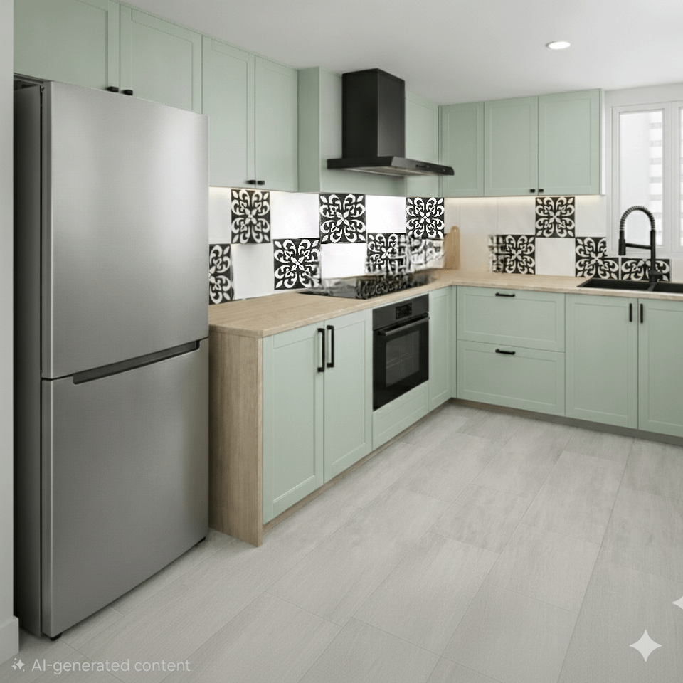
4 is 20×20 but i felt the pattern added an interesting touch. Also matte.
AI botched 5 but you get the idea, haha. It has a personal touch to it. The pattern reminded me of the pattern on our wedding cards and door gifts 10 years ago. But felt it was "too much" so wondered if we could dial it down by alternating with the white tiles. Again, these are 20×20 so the grout lines are a concern. Also matte.
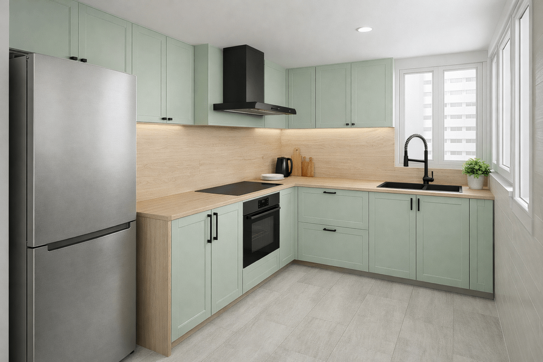
The last one is basically using the same material and design as the countertop, to me visually looks the "cleanest" but this option has an added cost.
by Little_Caregiver_976
46 Comments
Even if there is no gap with the countertop I like the second ones!
1 Or 3
#2 and #6 are my favorites, and #3 is the runner up
2
I like 1 or 2. Probably 2 best.
1, it’s beautiful with the cabinet color too.
1 or 5 for me!
#6
Definitely the last one, the whole kitchen looks balanced and easy to navigate in. And easy to clean, yeah.
Btw, wouldn’t microcement be cheaper for the backsplash? It would be visually more or less the same or maybe better with the same or a bit different tone but still not glance as the tiles.
2 makes the kitchen look fresh and airy
I totally get the grout struggle – it’s the #1 complaint we hear with tiled backsplashes.
And what tempered glass splashbacks? Have you taken it into consideration?
A custom tempered glass splashback could be the perfect solution: completely seamless (zero grout lines), super easy to wipe clean, and very practical for everyday use. We can make it to your exact dimensions in a solid deep green for that dramatic look you love, a simple one-colour option, or even with a printed tile-effect design if you still want that tiled vibe without the maintenance hassle.
Additionally, you can select among hundrends of different designs, artistic, nature, landscapes, stone, and whatever you wish… You could even send the design you prefer and we can adjust it to the backsplash.
Feel free to check out examples at [https://www.conceptcrystal.com/collections/wide-format-splashback](https://www.conceptcrystal.com/collections/wide-format-splashback) – happy to help with measurements or ideas if you’re interested! 😊
https://preview.redd.it/g62dii1jyvig1.png?width=647&format=png&auto=webp&s=eb69b22b5648765166b54df1b5c5e5149f1e2fa1
2 or 6
If I had to choose, 2, but what about white subway tiles on picture 1?
2 definitely
4 and 6
6, I love how aesthetic and cosy it looks with the wood
I love 2, it warms everything up. 1 is good but too green on green. It’s giving hospital
I like picture four
I love 1 and 4!
3 because it makes the fridge look more integrated in the kitchen. 2 is also very nice.
I like 1.. but i have concerns about the stove fan.. why is it jutted out that far? what’s behind it?
it’s not even covering the stove.
Love #2!
In order of preference; 1, 4, 2.
I flippin’ LOVE the color you’re going with for the cabinets.
For me, 2 by far. It’s warm and inviting.
2
This isn’t helpful but any of 1 thru 4 are nice.
2. Complements the cabinet color the best while giving the room more life.
I would pick 4. But 1 would nicely.
I like the first one, very calming, but the patterned tile is very energetic and if that’s what you want, go with that.
The very large tiles are going to yield an institutional look because commercial building favors huge tiles on walls to minimize grout cleaning.
I do not like the shiny cream colored ones period but also that style is a fad that will be instadated.
I liked one as soon as I saw it, but like two better (seems bright and happy).
I really love your kitchen (simple with clean lines) and I’m saving both photos as examples of what I want if I ever have the funds to make something of my pieced together “kitchen”.
I like 4 and then 1.
Anything EXCEPT 3 or 5.
Please not the gray.
I like the ones that match the countertop best and would be the lowest maintenance. But I don’t. understand why the green would have more grout maintenance than the others that are grouted.
IS there an option for a refrigerator that matches the other appliance?…as in black? Or choose stainless for the hood and oven and maybe brushed nickel for the pulls. Those will be less maintenance than the black. Over time you may begin to hate the black sink and faucet, honestly. It will show water spots and will be difficult to keep looking nice because of that. Black in a kitchen is HIGH maintenance….just saying.
4
2! The pale yellow looks easy to maintain clean looking and warms up the kitchen nicely.
2 or 6
What is 6? The same material as the counter?
What is the counter material
2
#2
I can’t decide between 2 & 6.
4 is my personal favorite
I love the first one with the green subway tile. The finish reflects light beautifully. The beige ones are just kind of boring. The patterned tiles are a bit busy, might get tired of them quickly or when trends change.
Also wanting to know the counter material… as I like 6 as well. Is it travertine?
#2
I’d pick 1 or 2. In 3 the tile is too big, 4 & 5 the pattern is busy and overwhelms other kitchen elements and I don’t like look in 6.
If you love the dark green in 1 shop for a slightly bigger version to compare it before you decide.
Yeah 1 looks nice, I also like 4.